It’s not often we see a house designed by Mario Buatta in Houston. Usually he works in New York or Florida, rarely Houston. But there it was, in Architectural Digest (2007), all beautiful in pinks and greens and yellows. The Buatta house is being publicized again – it’s now for sale, and listed on HAR, the favorite real estate haunt of nosey Houstonians or house stalkers (not talking about me, of course) – you know, those obnoxious people who search HAR’s website to find a house to either admire or hate, and then run to the tax rolls to discover who owns it. The Buatta house is a little more intriguing because of who owns it and what its competition on the market is. You see, the lady of the Buatta house, is related to the lady of another grand house for sale, right down the street a-ways in Houston’s toniest neighborhood. One is owned by the mother, the other is owned by the daughter – both still young, vibrant, civic-minded women. See if you can figure out which house the mother owns, and which house the daughter owns. To be sure there is peace in the two households, both are using the same real estate agent!
P.S. If you live in Houston, see if you can guess who owns the houses. There is one HUGE clue in the pictures!!! To play the game, if you already KNOW who owns it, don’t ruin it for those who are guessing. Feel free to email me with your story: mrballbox329@aol.com.
The Tale of the Tape:
House #1: $10,800.00
Over an acre, backs up to the golf course of RRCC
13,386 Sq. Ft. /3 stories /5-6 Bedrooms/9 Full, 2 Half Baths
Built: 1988, designer unknown
Garage: 3 cars
House #2: $9,950,000.
Over 1 1/2 acres, backs up to busy Kirby Street
7,968 Sq. Ft./3 stories/5 Bedrooms/6 Full, 3 Half Baths
Built: 1939 by renowned John Staub; interiors by Mario Buatta
Garage: none
Pool Pavilion: 3,331 sq. ft. designed by Curtis Windham, 2007
House #1:
Both houses are located in River Oaks, Houston’s most exclusive neighborhood. House #1, though, is on the golf course of the River Oaks Country Club, primo real estate to be sure. You really can’t see the house behind the gates if you are cruising the street, but cruising the internet it’s no problemo at all. Lots of flowers, including beautiful rose gardens, are included in the landscaping.
House #1 is a Regency style home and is relatively new for River Oaks – built in 1988. At over 13,000 sq. ft. the facade belies the true size of the house.
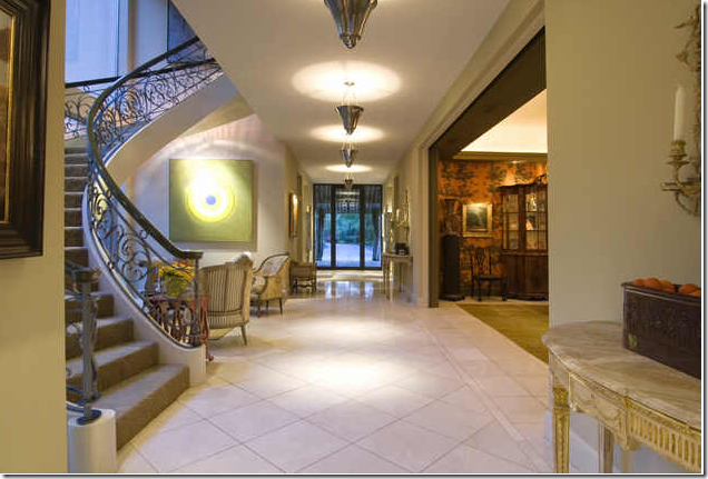
The front door is seen at the end of this entry hall. The dining room is to the right. The house has a definite contemporary vibe going on: is this the mother’s house, or the daughter’s? Would the daughter like contemporary or the mother? I don’t know the interior designer used in House #1, but judging by these pictures, I might guess it was done by the great and elegant Herb Welles or his partner Jerry Jeanmard. But, like I said – this is ONLY a guess!
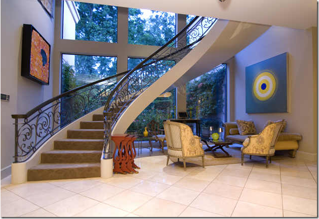
Contemporary art work lines the walls of the two story stairwell. Note that the furniture is not contemporary, but classic French antiques.
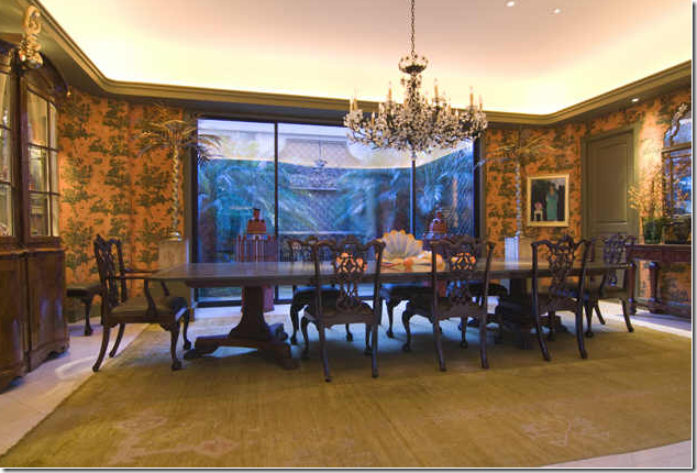
The dining room is wallpapered in a toile. Antique rug and furniture.
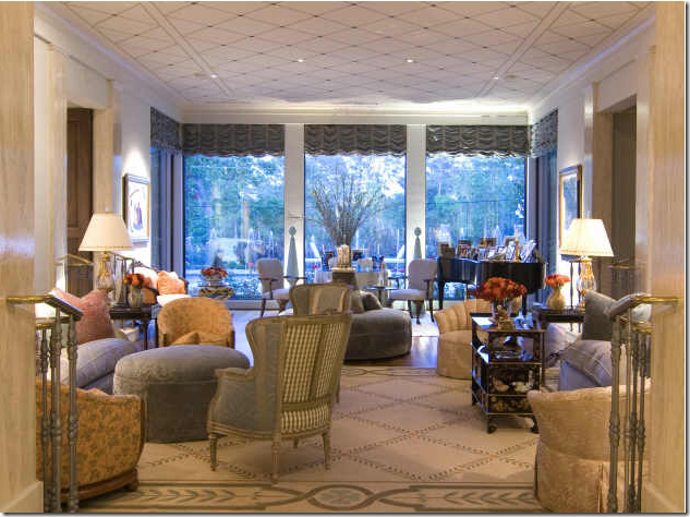
At the end of the long entry hall, down a few steps, is the expansive main living area. This room is filled with richly upholstered furniture and more French antiques. The view out the windows is of the pool, the rose garden, and the golf course. There are very few golf courses located inside the city limits of Houston – real estate along these courses is very pricey.
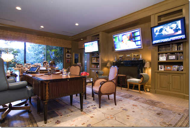
The paneled office/library is set up for a true businessman or woman. Three TVs are great for news and sports watching. Would an older man want three TVs or a younger man????
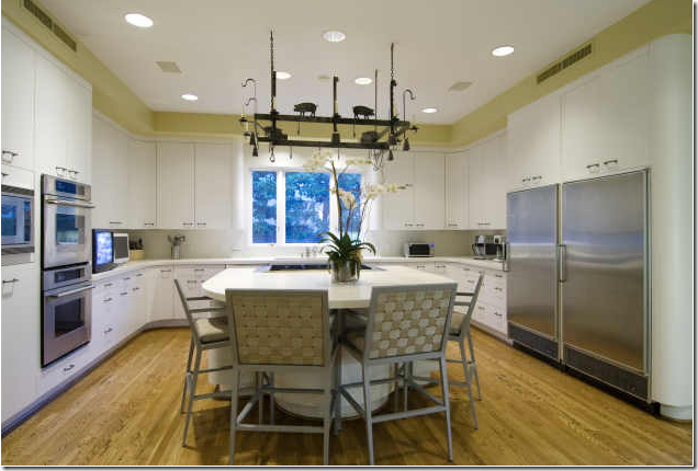
The kitchen is a good size for a large family – with lots of children? It looks like there are more televisions in this room. Someone must be either a political junkie or a sports junkie in this family!
The large family room appears to me to be an addition - located off to the side of the main house. Notice the paint treatment on the ceiling. This room looks like it was designed for large crowds – push the furniture to the sides and you have a ballroom!!
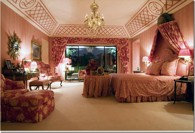
The master bedroom is oversized and is all in pinks, both hot and soft. Out the window is a balcony that overlooks the swimming pool and golf course. Must be a gorgeous view! This room is directly on top of the living room.
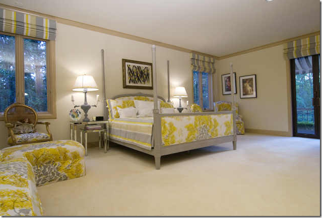
This large guest room overlooks the front of the house.
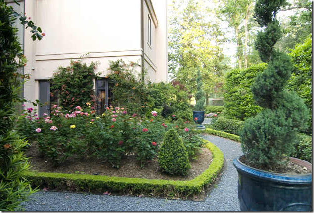
One of several rose gardens on the property. It appears this one is located right outside the stairwell.
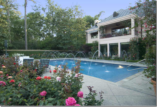
The back yard: the three large windows are the living room. Above is the master suite with its private balcony.
Past the swimming pool is the River Oak CC golf course. Expansive views like this are rare inside the loop.
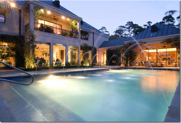
At dusk, the living room and master bedroom balcony are on the left. The large family room is to the right. It looks like this was added on, perhaps it was once the garage? Is this large swimming pool for children or grandchildren? Have you already made up your mind if this is the mother’s house or the daughter’s house? Wait………
House #2
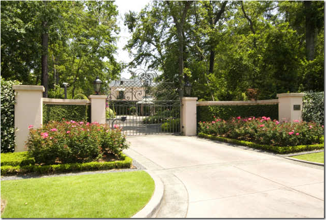
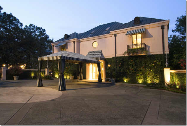
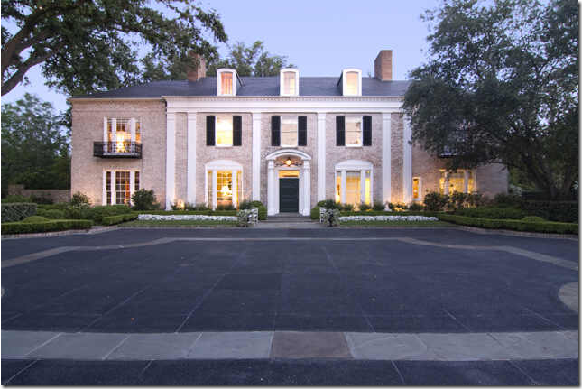
House #2, right off busy Kirby Street. This lot is on 1 1/2 acres – 1/2 acre larger than House #1. The front has a large parking court – room for plenty of partying guests! This classic house was built in 1939 by famed architect John Staub who helped develop River Oaks.
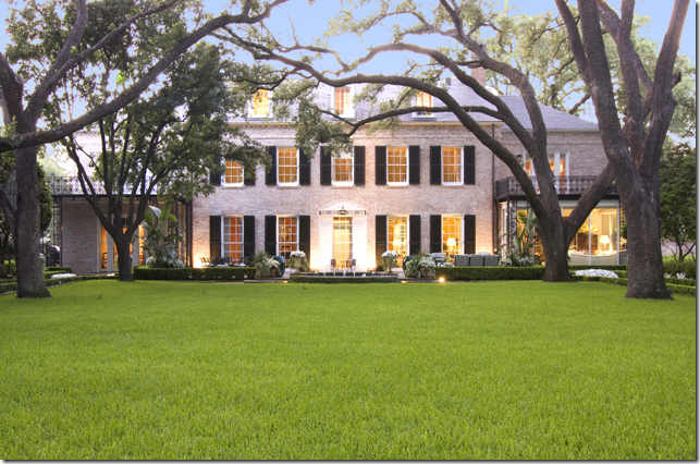
The back facade of the classic Staub house. It looks like there are two balconies flanking the main section of the house – underneath the right balcony, the area was enclosed to make a sun room The area on the left looks like it was left open.
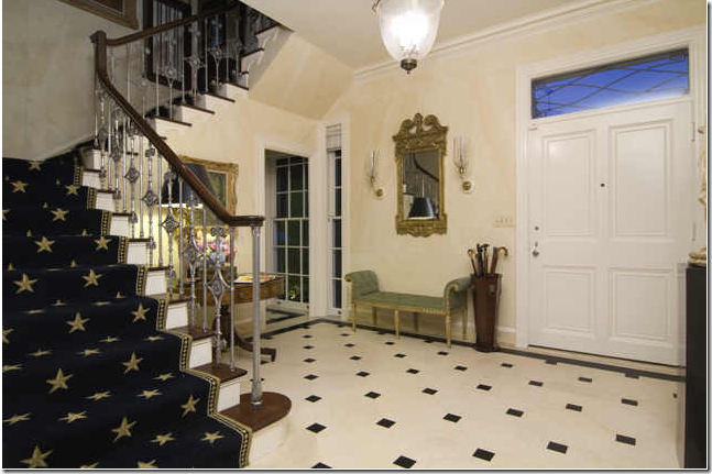
The front entry hall is quite different from House #1. This foyer is relatively small looking, but probably this is just an optical illusion.
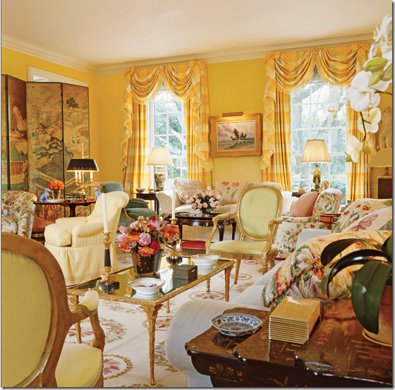
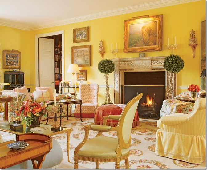
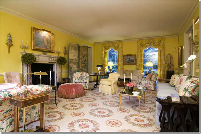
From Architectural Digest: the main living room is painted a Nancy Lancaster yellow, filled with English and French antiques and English styled upholstery. Designed by Mario Buatta, this room makes no mistake about that. Unlike House #1 with its contemporary art collection, House #2’s art is more traditional.
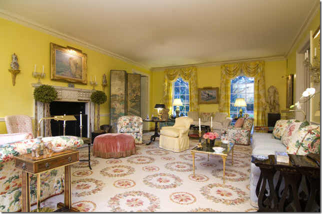
Yellow silk plaid curtains and a classic Colefax and Fowler fabric dominate the living room. The two living rooms in House #1 and #2 are similar in their quality and quantity of furniture. But which living room is mother’s and which is daughter’s?
The real estate pictures are not quite as enticing as the Architectural Digest photographs taken by Gordon Beall, but the room still looks beautiful. It would be interesting to see House #1 under the Architectural Digest lens, too – to level the playing field! These ceilings appear low – they are actually a lofty 10’ high.
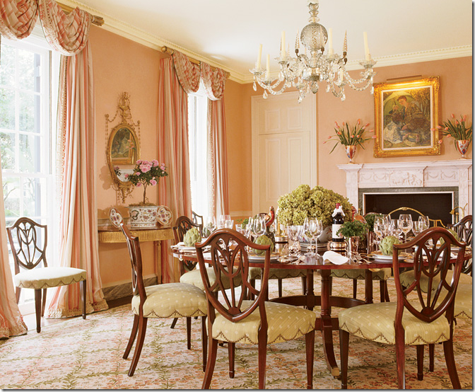
The beautiful pink dining room with its white fireplace and Nesle chandelier looks cozy in this picture by Architectural Digest.
In real life – seen in the HAR pictures, the room is very large – 24x17. The carpet is by Starke.
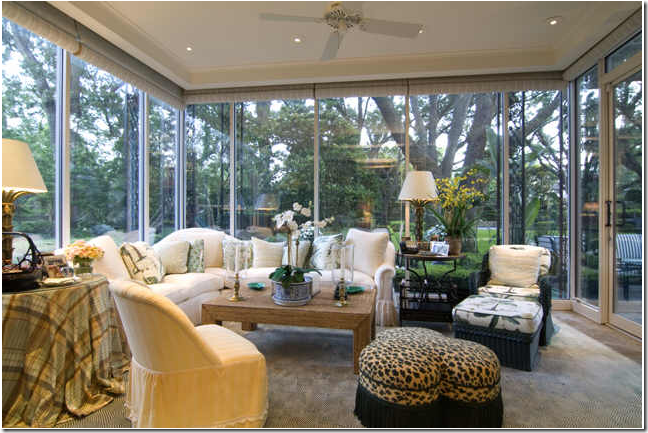
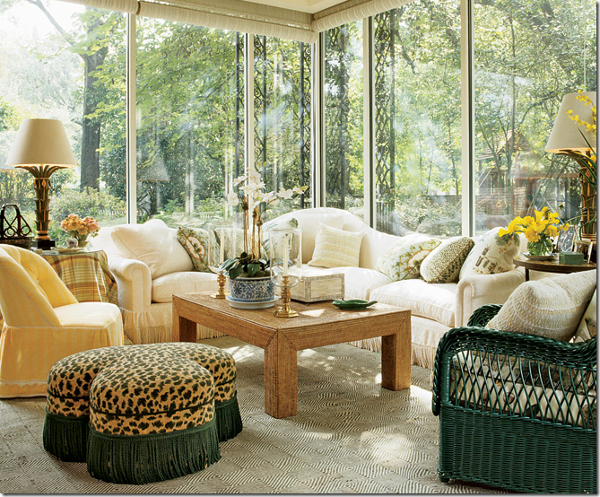 The morning room is in a glass-enclosed space, located under one of the balconies. It is a cozy spot overlooking the back yard.
The real estate picture shows the true size of the room.
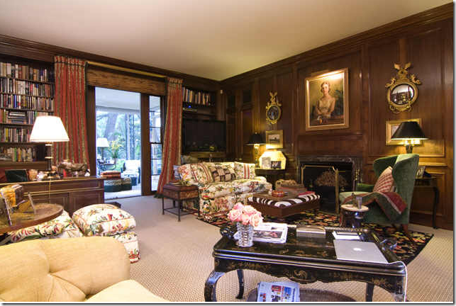
The library in its original mahogany paneling is traditionally English. Is the portrait the lady of the house in her younger days, or is it the mother in her younger days? Hard to say.
The real estate photos of the library. The morning room is right outside the doors.
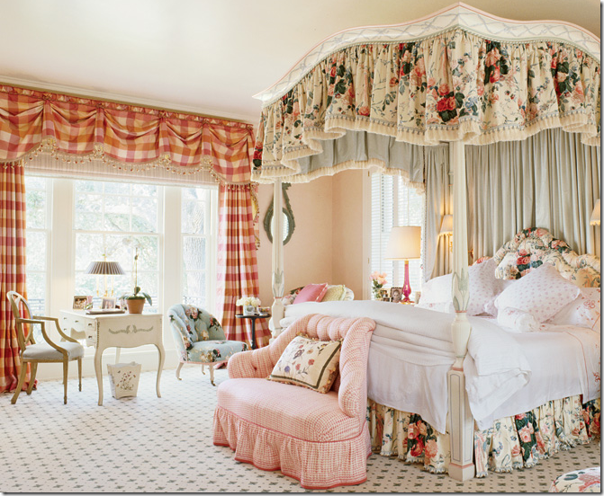
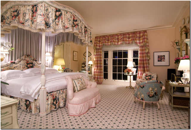
The master bedroom is a pure Buatta pink fantasy. With his traditional four poster bed, there is no mistaking who designed this room – but for whom? The daughter and her husband, or the mother and her husband?
Taken at night for the Houston real estate web site. The chintz on the bed is Lee Jofa, the carpet is by Starke. With the windows on each side of the bedroom – its runs the width of the house.
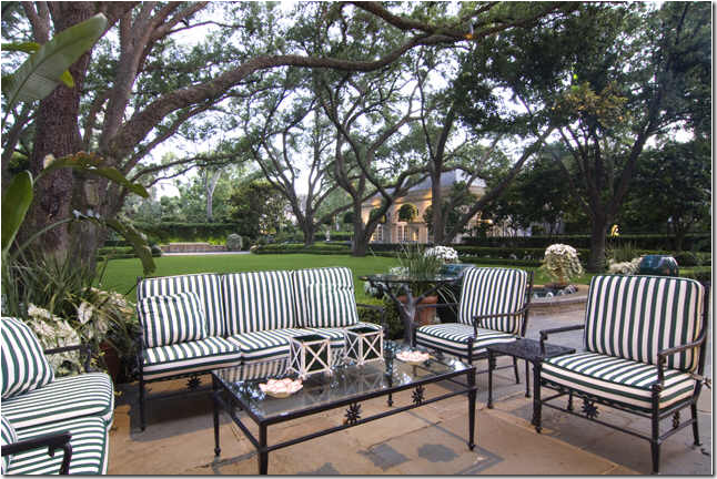
The porch along the back of the house with classic iron furniture in green and white stripe cushions – very southern looking, to be sure. The recently built pool pavilion is off to the right. Does this look like a place for children or for grandchildren?
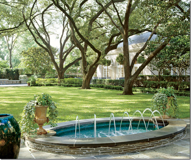
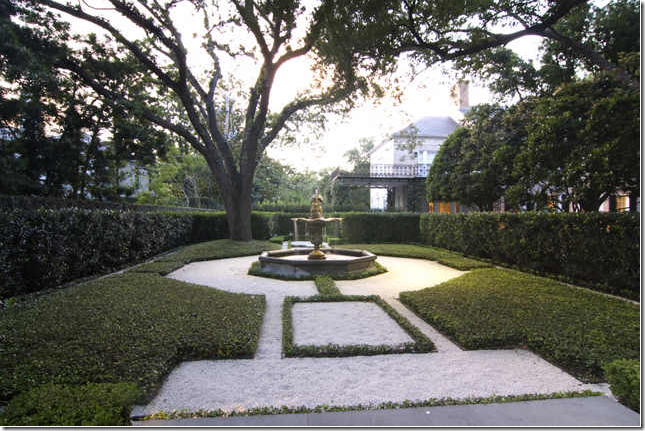
Looking from the back of the house out to the yard – the pool pavilion is on the right, past an allee of Live Oak trees. The swimming pool is directly facing the house – past the trees.
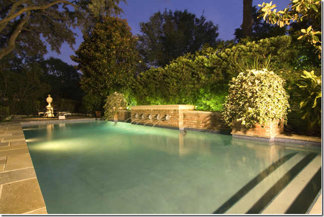
A night time shot of the large swimming pool.
A hidden garden off to the side of the yard.
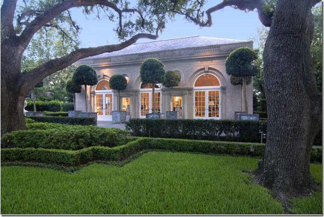
A view of the pool pavilion.
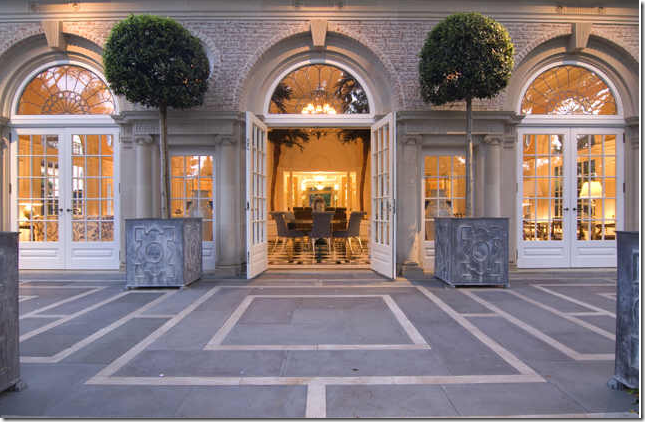
At over 3,000 sq. ft, the pool pavilion is larger than most houses.
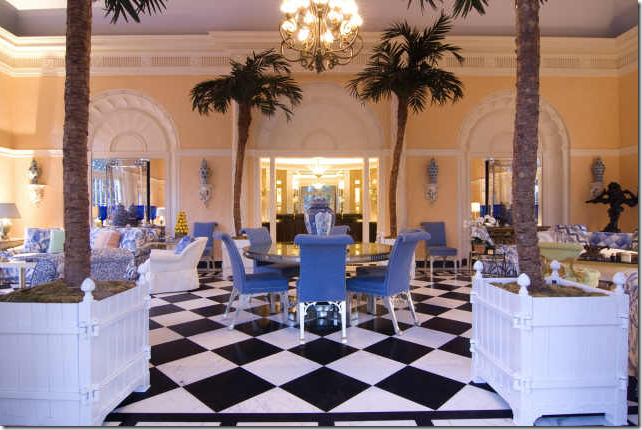
Buatta designed this space also. The checkerboard floors were inspired by the lobby at Claridge’s hotel in London.
The real estate photograph. What a grand space for large parties with live bands and dancing! Past the middle doors is the bar area, seen below.
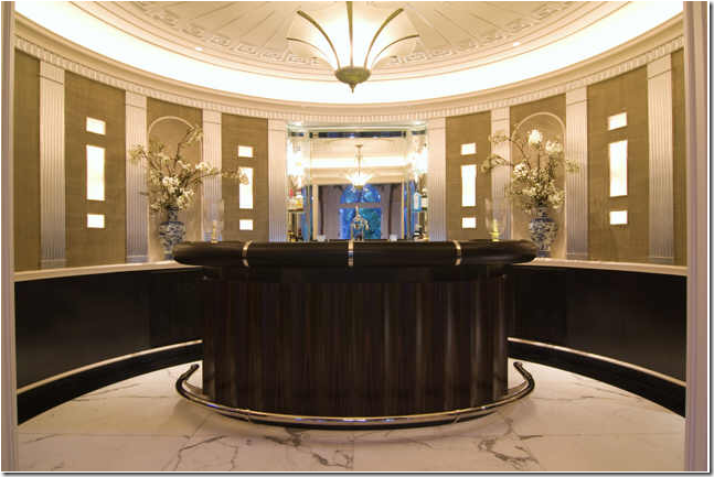
An oval bar in the pool pavilion – complete with white marble floor. This building also houses an exercise room, a library, and a kitchen for entertaining. Obviously this “pool pavilion” is really for grand parties rather than a place for playing children – or grandchildren. Again, is this the young daughter’s house or is it the house of the still-young herself mother?
To Recap:
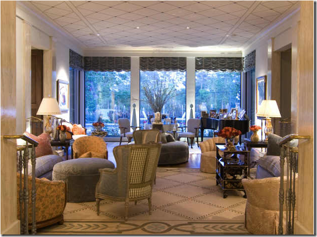
House #1’s living room:
House #2’s living room:
Do you think you know which house is for a young family, with young children and which house is for an older couple, with no children at home? Does the fact that Mario Buatta designed one of the houses sway your opinion? Or does the location sway you – one house on the golf course, the other on a larger lot, but right off a very busy road? Do you have a favorite house? Do you prefer the more contemporary one, with the French antiques, or the older, more traditionally styled house – with English antiques and furniture? Does the furniture give away which one is owned by the daughter and which by the mother? Do you wonder why both houses are for sale at the same time, both sharing a real estate agent? Are they downsizing or moving up or both? Maybe they should just trade houses!
P.S. Remember if you happen to already know who lives here, don’t spoil the fun for those playing along!








No hay comentarios.:
Publicar un comentario