A living room in a bungalow that recently sold in Houston. Can you tell immediately that the person who lives here has style and taste? Actually she is a young and very gifted interior designer.
What DOES make good taste? Why do some people just “have” it and others, well, just don’t? Why is it that most people don’t care in the least what their house looks like, while the other few obsess over every item that comes in through their front door? Why do most people have houses that aren’t designed? It’s not about money – you don’t have to have a lot of money to have a well decorated house – one that is stylish and put together. The white slipcover sofa with classic lines from Ikea cost just $349 – some people spend more on a good meal with a few bottles of wine.

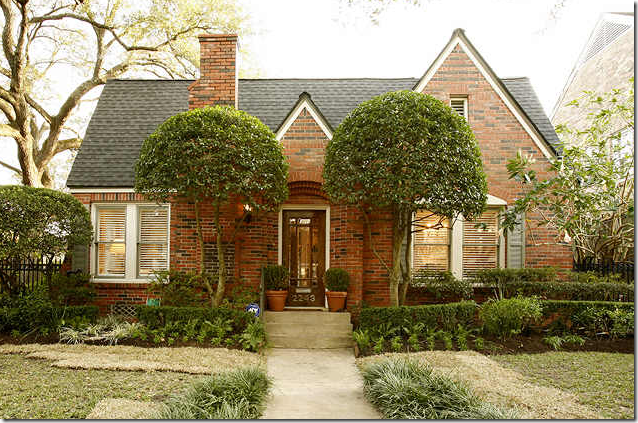
I love to look at the Houston Real Estate web site. Finding a house designed by a top designer like Carol Glasser or Pam Pierce is always the object – and when that happens, which is rare, it makes the hunt worthwhile. And, by the way, when is someone going to buy Ginger Barber’s house already? It’s fabulous and affordable – I can’t believe it’s still on the market! But I digress. It’s much more fun to look at houses designed by the top four or five designers in Houston than houses not designed by anyone at all, least of which the owner. Sometimes the ad will say who the house was designed by. Sometimes you recognize it from a magazine. Sometimes, you just have a feeling. But those kind of celebrity sightings are rare and far between. Mostly, the vast majority of houses on HAR look like those above and below. Not bad, not ugly, just boring. After awhile, they all start to look alike. I know there is love in these houses, and life, and happiness and sadness too – just like any other home – but there surely isn’t any style!
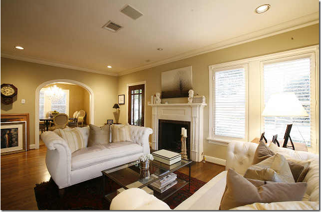
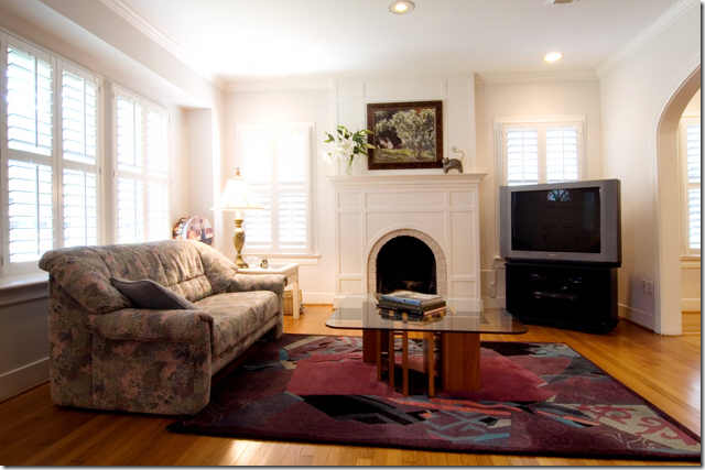 Beautiful bones in a bungalow for sale: Moldings and plantation shutters, arches and hardwoods, a wonderful fireplace. Could you design this better?
While it IS great fun to look at all the expensive houses and dream and ooh and ah, I do always seem to be showing you houses that few of us can really afford. But the secret truth is, nothing gets me more excited than seeing a house which is NOT expensive yet looks like it was designed by a professional! Nothing is better because it affirms what I fully believe, style is not about money. So today – I will show you six houses with style – owned by people obviously young and just starting out and working within a budget. Their houses are small and are moderately priced for the market near town. It took me two days to find just six houses to show you – and that includes looking at all the houses within the 300k to 500k price range, inside the loop – for sale, or already sold. I can’t imagine how many houses I actually looked at – hundreds, if not thousands. Many houses were nice enough – just bland, or it looked like they went to a furniture store and bought up the display. There was no imagination or attention to detail in the vast majority of the houses. Most were clean, neat and organized – though quietly dull. More amazing is how few houses (in any price range) are actually decorated or styled. Even fewer have hired an interior designer – how do any of us designers actually get any work???? I think the majority of the houses I picked are probably owned by a designer and it shows. What is truly interesting is that all of these six houses I picked to show you have already sold – I couldn’t find one attractively designed house in the price range that hadn’t already sold – maybe that says something about the decor? A nicely furnished house will sell faster, that is to be sure. Style is elusive, it certainly isn’t about money or station in life – anyone can have an attractive house, if they so desire. The problem is most people just don’t desire. Give them a flat screen TV and a leather recliner and they are happy. I wish I was like that - life would be so much easier for me, there’s no doubt of that. Forever fussing over your house, rearranging the accessories and constantly moving furniture around can be tiring and anxiety producing. I do wonder who is happier? Those who live with style or those without?
House #1: This house recently sold in Houston in the high $300,000. Although it is located about 1/2 mile from the Galleria, a great location to be sure, the neighborhood is not a “preferred” one, it is somewhat isolated and next to a noisy freeway, which probably accounts for the low price tag. But still, it’s perfect for a newly wed couple or a young couple with small children. Built in 1957 and only 1500 sq. ft – this house is designed to the max and is one of the prettier designed ones.
It has great curb appeal - the landscaping is perfect. And the siding emphasizes it’s Ranchburger origins – it is charming.
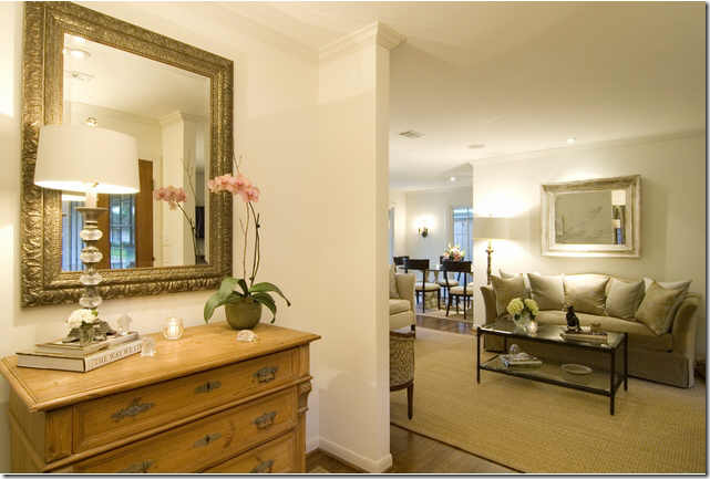
It is obvious from the foyer that this house is well designed. Painted all white with dark hardwoods, the background is a good neutral. In the foyer, she (and yes, a woman designed this!) has used a nice mirror. Antique? Not sure, maybe, it might just be a nice vintage mirror. The chest is pine, again not an overly expensive piece of furniture, but it’s wonderful! Notice how the accessories are spare – just a single orchid and a lamp and few votives.
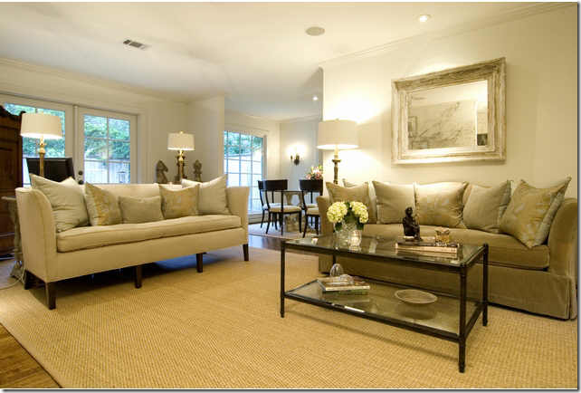
The family room is the only living area in the house. Instead of furnishing it casually, the owner chose to keep it somewhat dressy – as if it was a living room. Two sofas, one classic in velvet and one contemporary in twill, share the long narrow space. A custom cut seagrass rug makes it all look just a little nicer, in my opinion! The colors throughout the house are constant – white walls, dark hardwoods, seagrass and khaki and taupes with black accents. Behind the second sofa, it appears there is an armoire and a sofa table that holds the two lamps. One thing – I would have hung the mirror vertically – I think it lifts the eye upward, making the ceiling appear higher.
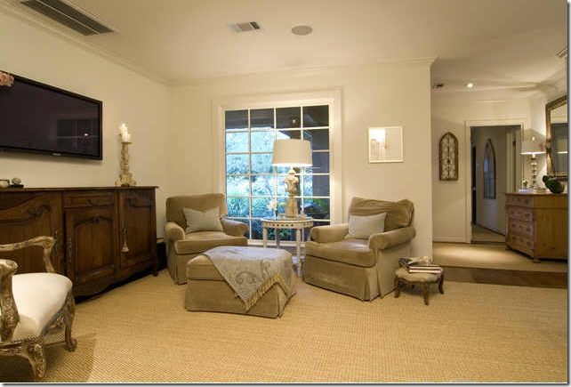
At the front of the room a long French buffet sits under the tv, along with two club chairs and ottoman. The two club chairs look like they belong to the velvet sofa. Is it custom? I’m not sure. All the seagrass is custom cut which adds to the richness of the look. A tip: seagrass is relatively inexpensive, yet you can see how it definitely makes the house look extremely stylish and rich – well worth the effort.
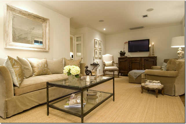
One more view of the room. It’s possible that the sofa and club chairs were once in one room and the second sofa came from another house which would explain the two different sofas. The pillows do look like they were custom made, not store bought which makes me think the sofa and chairs were custom also. While custom upholstery is wonderful, it is usually less expensive to buy retail.
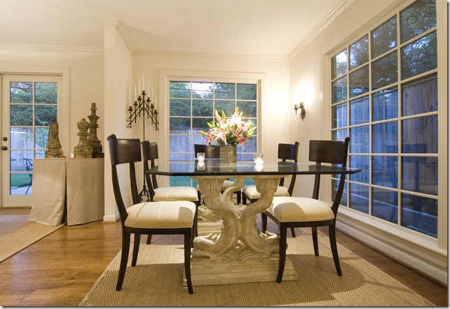
The dining room table is two pedestals with a glass top and simple chairs surrounding it. Notice there are no window treatments. The windows are beautiful – leaving them uncovered makes the house so light and airy. The expense to cover all these windows would be a small fortune. Leaving them bare makes a statement almost as strong as having curtains. A tip – if you can’t afford nice, lined curtains, it’s better to leave the windows uncovered. Cheap, limp panels really add nothing to a room.
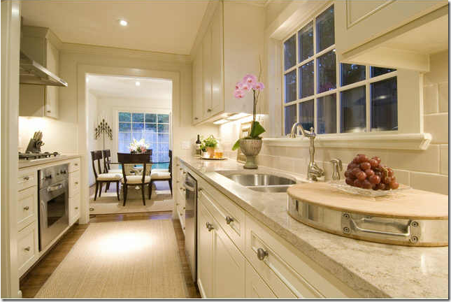
The kitchen was obviously totally redone. It looks like the countertops are a creamy travertine or granite. The appliances look deceptively expensive. Instead of a fancy range, there is one wall oven and a cook top, married to look like one appliance – which is a great idea. Hardware is simple and elegant. And again, accessories are kept to a minimum. The seagrass is carried through the kitchen which gives it a room-like appearance and dresses it up. Since this house is so small, it’s a good idea to make the kitchen flow with the rest of the house. And in such a small house, it is always wise to keep all the paint and elements neutral and alike – it expands the space.
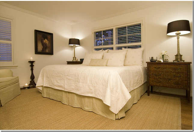
The master bedroom is simple with the same elements – white walls, hardwoods and seagrass. The bedding looks like a duvet cover without the filler and there is a tailored dust ruffle. There isn’t a headboard – another cost saver. Wood shutters cover the windows in the bedrooms throughout. More black accents come through in the lamp shades.
The master bath was totally remodeled with a lovely vessel sink and a frameless shower. The owner added a gilt mirror to further dress up the space. So beautiful! I love the ledge here.
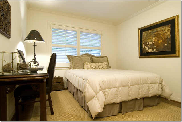
This guest bedroom doubles a study. Again, same elements – white walls, seagrass, and khaki colors.
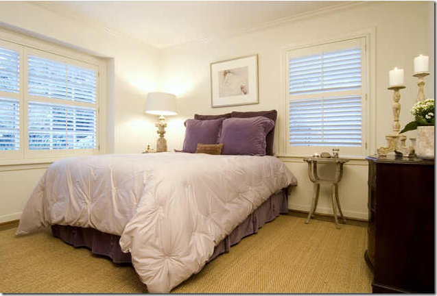
In this room – the lilacs are the only color used in the house! So pretty!!!! Again, none of the beds have headboards. The euro shams acts as a headboard for all the beds – another great cost cutter. One pretty lamp – and a few classic wood candlesticks are the only accessories. Tip: don’t clutter up your space just to fill in and add stuff. Wait until you have something pretty!!!
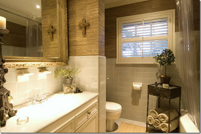
Not sure if this bathroom was redone or not. The soap dishes in the tile look vintage. Again, an added mirror and here, grass cloth wallpaper gives it a special touch. Grass cloth can be very cost effective wallpaper. Darling towel holder. Again, a wooden candlestick – the designer repeated the same accessories throughout – another great tip, if something looks good – repeat it!
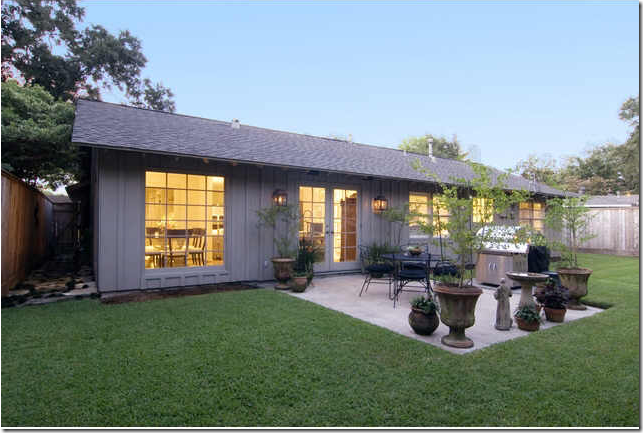
Here, you can see how small the house actually is. The back isn’t landscaped like the front – another cost saver. Instead, the owner added a few potted plants to soften the patio. This house is amazing to me. In a city where almost every decent house near town is now over $500,000 – this house is well below, yet it is as beautiful as any. Why? The elements were kept neutral throughout – white walls, dark hardwoods, taupe and khaki fabrics, and seagrass. Accessories are spare – there is no clutter. Despite this, the house seems full, not empty or undone. It is tasteful, every piece was handpicked with deliberation. And I venture to guess the owner is an interior designer – which helps!!!! Very, very beautiful – and something to strive for when starting out.
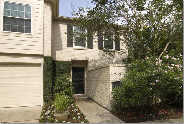
House #2: This house was built in 1979 and is almost 2,000 sq. ft. It sold this year for around $350,000. It is located in West University. The drawback is its back yard faces a busy street. But, at this price, to live in West University in a house this size, it’s a steal. The outside is beige painted brick and there is a front courtyard. I wanted Elisabeth’s newly married tutor to buy this house, but it was already sale pending when she was looking. What a great starter house as you will see.
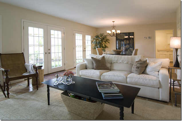
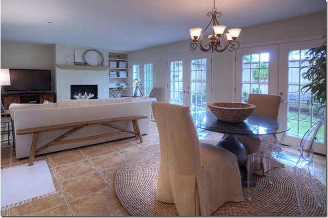
There is one main living area and a very small study in this house. The floor is tiled. You can see immediately that the owners are a young couple with the wife having a eye for trends. She has ultra trendy feedbag pillows on her soda and notice the hip spot light lamp next to the chair. The brick on the fireplace was painted to update it. I like how at the right of the fireplace, all her design magazines are neatly stacked and there is an antique iron folding table there. The doors were probably sliders but were updated with French ones recently. The mantlescape is interesting and textural and there is a trend-alert large shell on the hearth. Notice too the wood stump table next to the chair. Again, no window treatments – better to do without than to have cheap looking panels!!
Looking the other way – this house is much more casual than the previous one, but it still has a chic look to it. It’s more hip and trendy, less classic, but still very stylish. You can tell there is a toddler in the house and all the toys are hidden away in the big basket under the coffee table. Instead of seagrass, the owner has chosen what looks like might be either sisal or jute, probably from Pottery Barn, as it is not custom cut. The contemporary cream sofa probably came from PB too – a great place to shop and save money yet still be stylish.
The house is very textural – with the large pavers and the wooden bench and the round rug, which I adore! Two slipped chairs maybe from Ballard Designs and one ghost chair circle the chic zinc urn table made bigger with a piece of glass. The light fixture is not the best, but this couple was probably on a tight budget and probably just made “do” with what came with the house. Myself, if I couldn’t afford something nicer, I would have replaced it with a capiz fixture from West Elm or just a large paper ball light. Even an outdoor lantern from Home Depot would have been more effective, imho.
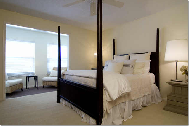
Upstairs, a large black four poster bed is made up with simple, neutral bedding. Notice the trendy lumbar pillow. In the sitting area are two simple textured chairs with white cushions. I would have used tortoise shell blinds from Target here – I think it would have been more effective. There are two other bedrooms – one is a nursery.
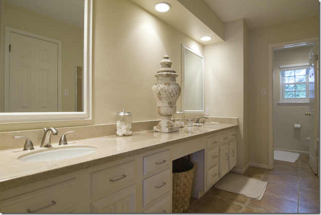
In the bathroom, the owner dressed it up with one oversized urn. Simple and effective.
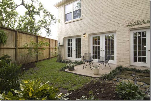
The backyard with the three French doors is so pretty – nicely landscaped. I think this owner might be an interior designer also. She is probably still very young and this couple is just starting out. I wonder where they moved to? This owner is more trendy and hip than the previous one, but still – they are both full of style!!!
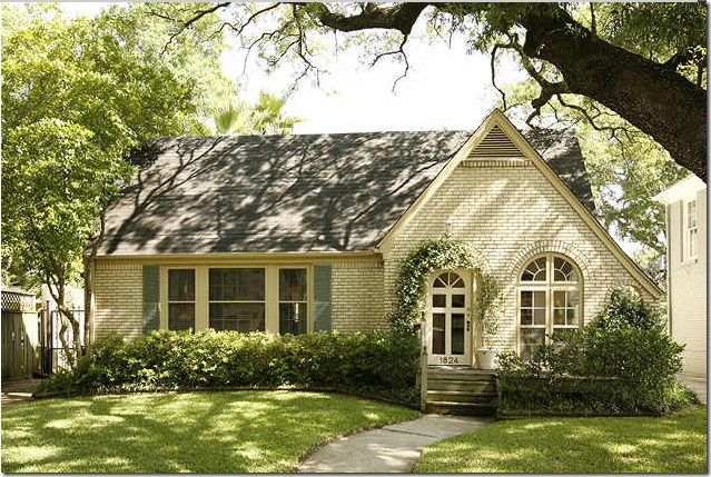
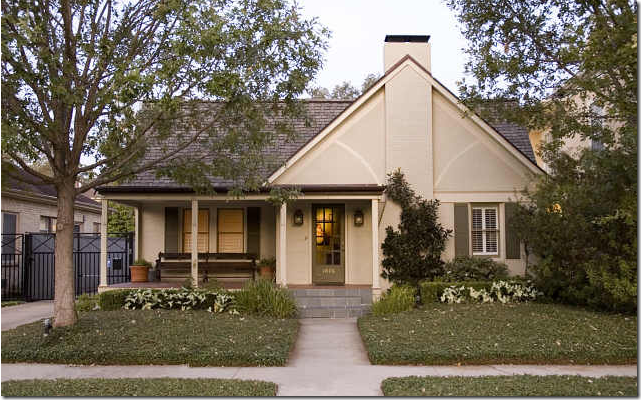
House #3: A charming bungalow, older than both of the first two houses by at least a decade. It was built in 1949 and is 1470 sq. ft. This house is “inside the loop” close to downtown in the Upper Kirby District. Not quite as prestigious as West University, this neighborhood is filled with young families just starting out and elderly people who have lived here their entire lives. This house sold last year for close to $300,000. Wonderful curb appeal – the brick is actually the original color. Just darling!
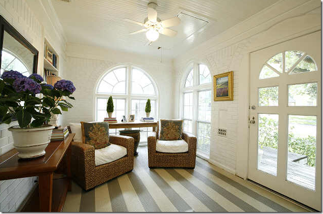
Inside the enclosed front porch, you can tell immediately, someone with style lives here. Not sure if the floor is painted or if that is floor cloth – either way I’m loving it. I also like the console with the mirror and the two seagrass chairs. Adorable!!
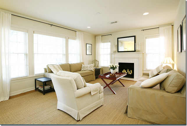
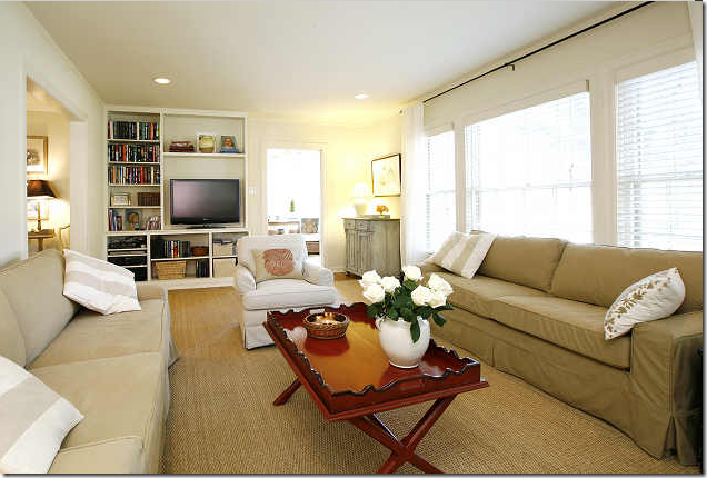
Custom cut seagrass makes the only living space look larger and more luxe. Two slipcovered sofas flank the fireplace. This owner chose to use curtains and to me, I would have paired Target’s tortoise shades with them for more texture. Also, I would have added panels between each of the front windows.
Facing the other way, you can see a Swedish inspired gray painted chest at the front door. The furniture probably came from Pottery Barn and the coffee table might have been inherited. With the seagrass, the house is clean lined and stylish looking.
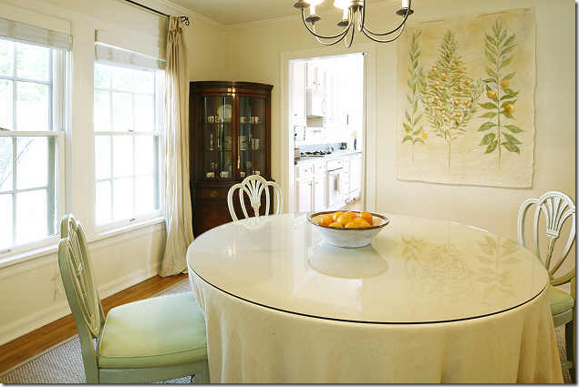
The dining room has a simple skirted table, a great way to get a dining room table without spending a fortune! The seagrass is carried into this room.
The kitchen has been updated, but not recently – it could use stainless appliances which would update it immediately. The breakfast room really adds to the spacious feeling in here.
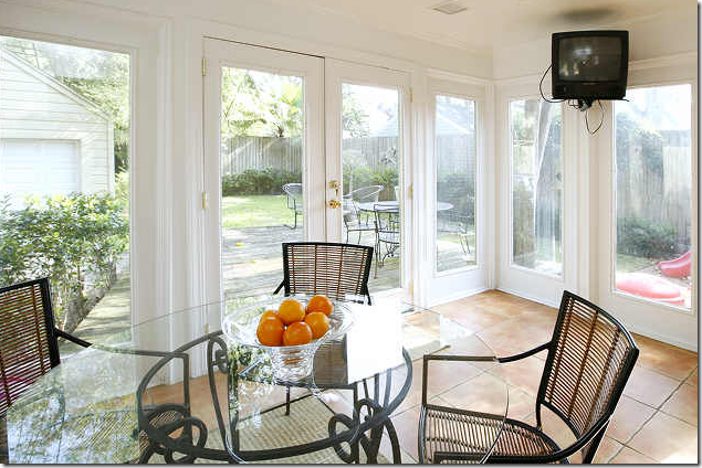
This room is an addition to the house – bright and cheery with a contemporary dinette set.
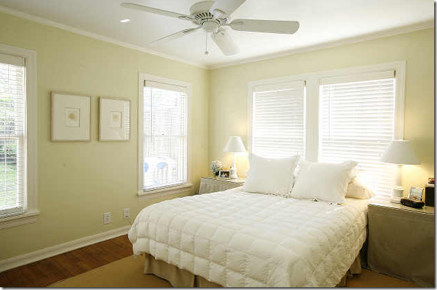
In the master bedroom - no headboard, and simple bedding. I like the night tables – skirted with a glass top. Less is more! Instead of adding furniture to the room, just to have something in there – the owner chose to keep it simple, a great tip to remember when starting out.
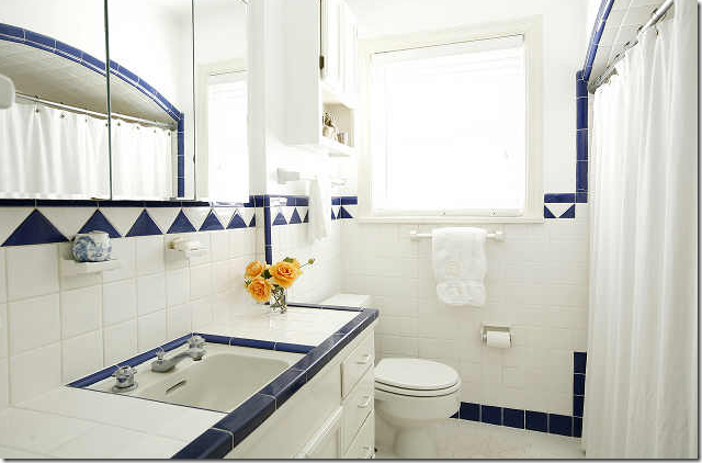
This has to be original – isn’t it wonderful!!! Notice in the mirror how the shower is arched. I love how she used a white curtain instead of a blue and white one – keeping it clean lined and simple.
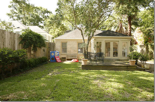
The backyard shows the breakfast room addition and deck. This house is very simple, two bedrooms, one bath. It is also very simply furnished. This couple, probably both working, with a young child, furnished the entire house in white paint, seagrass rugs, and khaki and white fabrics throughout. Stylish, easy, budget conscious, and nice looking.
House #4: An alert reader sent me this listing – thank you!!! Built in 1935, at 1690 sq ft, this house is the most expensive one yet – it sold for around $450,000. Also, “inside the loop” outside of River Oaks in Montrose, the curb appeal is again wonderful! I love that bench on the front porch and the paned front door. This almost looks like it could be in England. Charming.
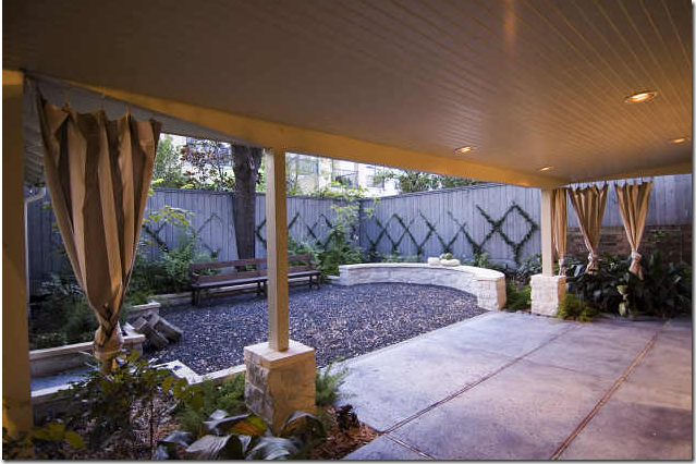
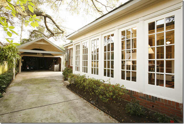
The back yard is professionally landscaped with a sitting ledge and gravel - very nice.
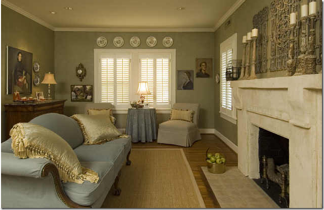
All the walls in this house have paint treatments. I suspect the owner is another interior designer. This room is very dressy and feminine. I like how she covered the antique sofa in a soft blue linen. The fireplace mantel looks like it was replaced. Very nice. Notice though, the seagrass is not custom cut! Ouch.
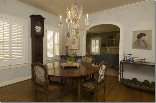
The dining room walls are lightly fauxed. Very pretty. I wonder if the owner is an artist? There seems to be a lot of unframed painted canvases around the house and I wonder if she did the paint treatments on the wall herself?
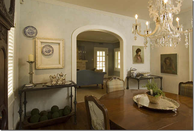
Another view of the dining room – I like the two matching consoles flanking the door.
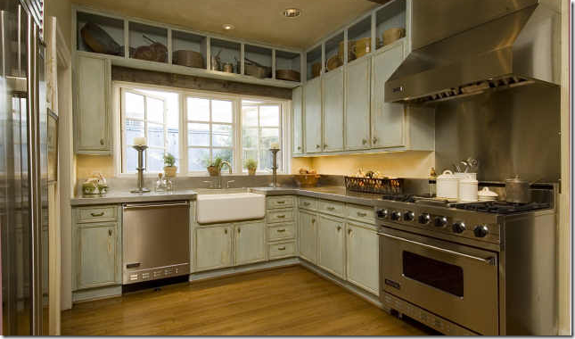
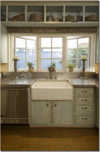
Here’s the reason why this house is more expensive – the kitchen. Major appliances!!!! Shaw sink. Beautiful casement windows. Notice how the cabinets are fauxed. And I love the upper cabinets open with antique copper pots in them. Very very beautiful!!!!
This picture is magazine worthy! The countertops look like concrete here. Notice the wood beam above the windows.
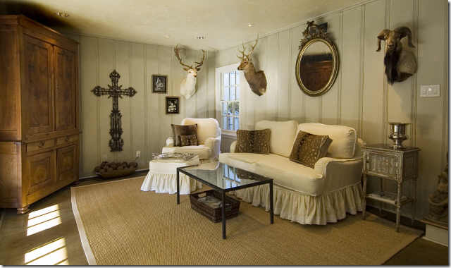
Unlike the other houses, this one has an extra living space which is charming with its paneled walls. Very cute, even though the mirror is hung a bit too high!! The slipcovers have the double ruffle detailing which is very nice. I love this room!!!!!
Charming bathroom with an antique chest as the vanity. Again, this bathroom raises the price of the house. There were no pictures of any of the bedrooms! This house is very “personally” decorated. The owner has a very strong, definite, sense of style and it shows.
House #5: Built in 1938, with 1658 sq. ft. this house recently sold for around $575,000 – making it the most expensive one shown today. The location, on a beautiful street in Southampton – one of Houston’s older and most beautiful neighborhoods, is driving the cost up, along with the fabulous kitchen, two bathrooms and pool. Again, as with all the houses shown – this one has great curb appeal – despite the obvious attempts to patch the front lawn.
The house is painted in a caramel color throughout which adds a touch a drama. Here, there are twin white tufted sofas and a black accent shag rug - hints that the owners are a young couple. The dining room is a real draw through the arched opening.
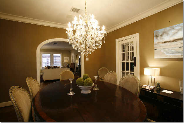
The dining room is indeed beautiful – with a large oval wood table and a set of antique French chairs in caramel suede. The chandelier is a real knockout. I like the swinging French door to the kitchen – it’s a nice, upgraded touch. I wish there was another picture of the living room – it looks like there is a full length mirror on the side wall.
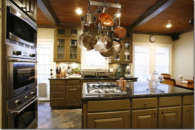
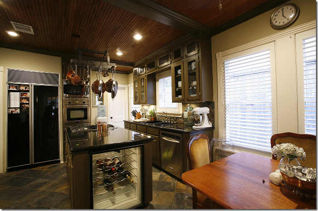
The kitchen is a real beauty and the main attraction of the house. The dark color continues in through here. Notice the dark stained bead board ceiling and beams. Very pretty!
The owners take their food very seriously here. I’m sure no one is eating cereal and Wendy’s Caesar salads in this house!!
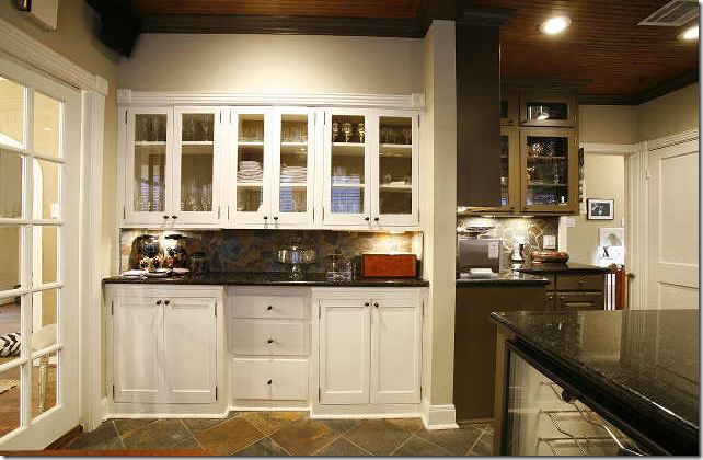
The dining room is at the left here. This white built in is in the breakfast area, a sort of butler’s pantry. Actually this is a great idea if you don’t have a beautiful, dedicated butler’s pantry like Gina of Willow Decor (here.) Just add a bank of cabinets to the breakfast area!
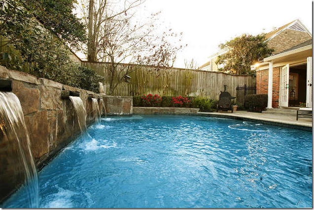
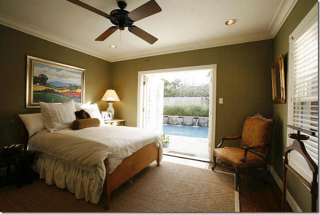 The bedrooms are at the back of these older homes – so it’s hard to get a view of the backyard from the living areas. Here – is the first glimpse of the beautiful pool. Again, the same paint color is used throughout which is a great space expander. Seagrass rug mixed with simple furnishings.
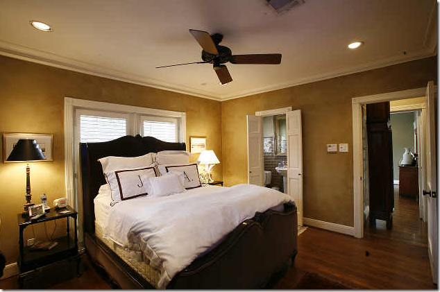
The master bedroom – the simple monogrammed pillows really pop the bedroom, but with a headboard like this, you don’t need much else!!
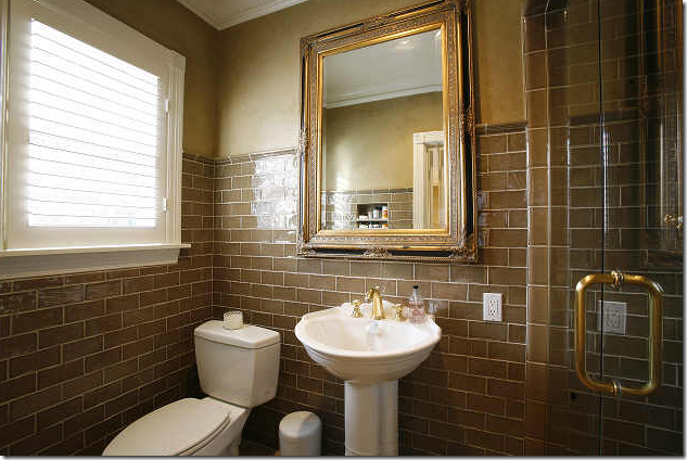
I love this bathroom – I wonder if the paint choice in the house was taken from this tile, or vice versa? Very very attractive and different. This house is more masculine than most of the others we’ve seen too.
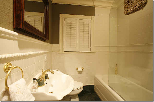
The second bathroom – I like the half shower door, it’s very European.
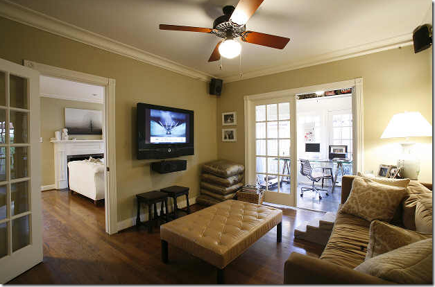
Something most of the other houses don’t have – extra living space plus office space. Nice.
The windowed wall along the living room and sitting room/office. This is really a darling house and for the area – it was a good deal. This truly is one of Houston’s prettier neighborhoods – located right next to Rice University, The Village, the museums and the best antique stores in town!!!
So pretty!!!!
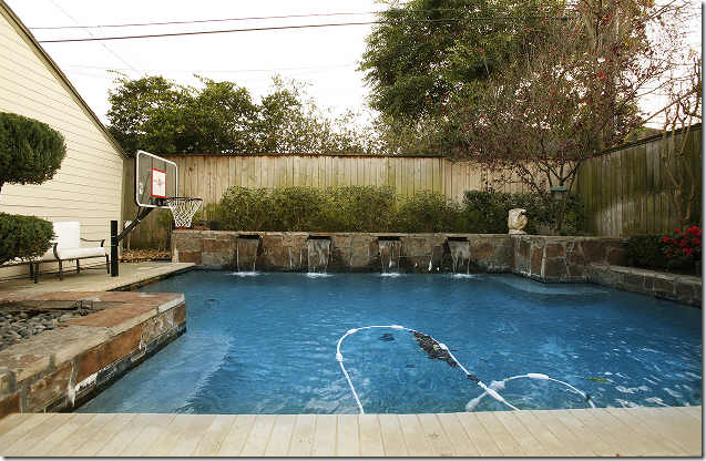
I mean – the basketball goal is actually cemented IN!!!!!!!!!!!!!!!!!!!!!!!! Talk about ruining a good thing!!
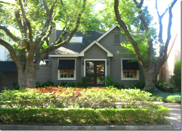
House #6: And finally, built in 1939 and at 2500 sq ft, this is the largest house, but I think the sq. footage comes from the garage apartment! This is on South Boulevard in Southampton arguably the prettiest street in Houston – though this house is about a mile down from that part of the street where double rows of Live oaks line the boulevard, their branches hanging low over the cement. Again, darling curb appeal with black awnings, chic dark gray paint and luscious landscaping.
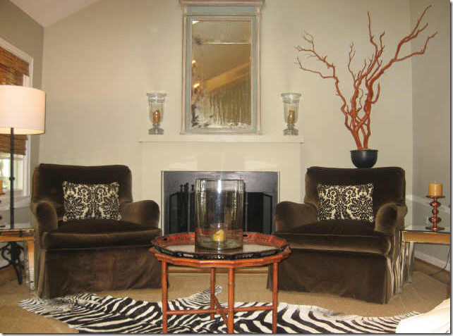
The front living room – trendy with coral, zebra, damask and mirrored furniture. Again, there is custom cut seagrass.
The other side with a wonderful chesterfield leather sofa and notice the cheetah skin! Whoa! I really want to bring the art work together and down about 9 inches!!! I like the lamps and the chairs too. I wish we could see the whole room. It looks like there is another white sofa that divides the space into two parts – you can just see it at the corner of this picture and the one above! Very chic.
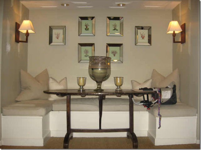
The dining room is an adorable space – a banquette with an antique wine table. So cute. You can also seee a baby’s seat at the table. At first I thought a man had designed this house and was excited to finally have found a male interior designed space, but the baby seat gives it away!!!
The kitchen has cute painted wood floors. I like that island – probably from Ikea.
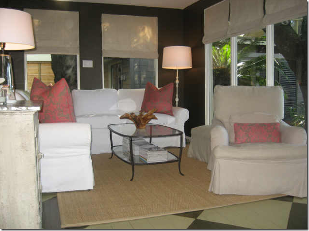
I really like this back study – with a small sectional probably the apartment size from PB. Love the pillows and the dark paint which pops the white slips. The painted wood floor extends back into this room. Nice plain linen window treatments.
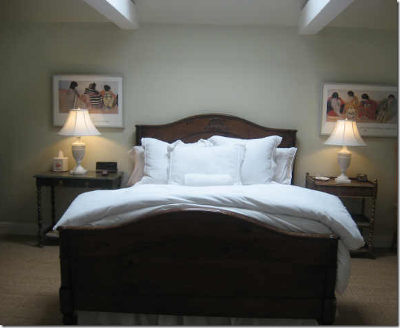
Simple white bedding, pretty lamps, seagrass. Less is more!
I hope you have enjoyed looking at houses in a normal price range for once! What lessons I have taken from this stylish owners are –
1. When you have a smaller house – treat all the rooms the same – same wall color, flooring, window treatments and basic color schemes. This helps unify the house and make it appear larger I believe.
2. Stick to neutrals. Notice there is not much pattern anywhere in these houses. Everything will be able to move to a new house and be reused.
3. Basic slipcovered sofas from PB and Ikea are great looking and easy on the pocketbook.
4. Skirt tables when you don’t have one!
5. Glass lamps are highly versatile. They are great to take from house to house and room to room.
6. Bedding is easy and cheaper when you use whites – just pile on a duvet and lots of pillowcases.
7. You don’t need a headboard – position several Euro shams against the back wall instead.
8. Custom cut seagrass makes any room look better – without a doubt. Additionally, covering worn hardwoods with seagrass is certainly cheaper than restaining the floors!!!!
9. Fancy kitchens and bathrooms are great, but aren’t necessary for a stylish home. Add a simple bowl of bright lemons and a fresh coat of paint to the cabinets and save yourself a wad of cash.
10. Stainless appliances dress up non nfbf21remodeled kitchens – and don’t go for the best appliances either. When you move, you’ll leave them anyway. Stainless looks good enough itself without having to splurge on the fanciest.
11. If you need an economical countertop, consider matt black or cream formica without seams.
12. Landscaping is more important in the front yard – curb appeal sets the tone before you even enter the front door!!!
13. And most important - less is more when you are starting out. Don’t junk up your house with grandmother’s leftovers if you don’t like them. It’s better to just leave a wall blank than to clutter it with something not stylish.
And most important - it doesn’t take a lot of money to have a stylish house. It DOES take someone with style though, someone who can edit and think creatively. If you are reading this – most likely you are exactly that person!!!! And, if I missed a small stylish house in Houston for sale or recently sold – please let me know!







No hay comentarios.:
Publicar un comentario