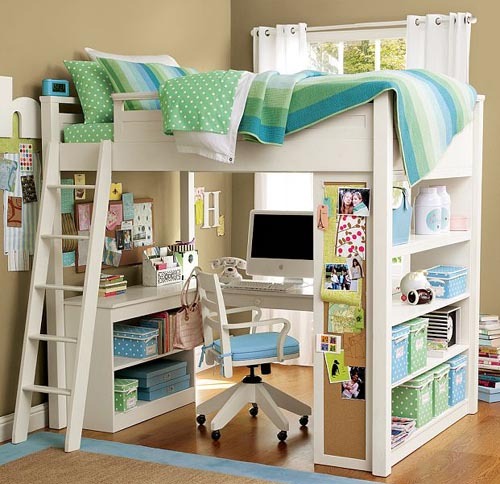
Esta es una linda idea para un dormitorio juvenil con poco espacio: La cama arriba y el escritorio abajo.
¿Qué te parece?


My first cover shot 2007: Georgie and Sammi Jo. Actually they wouldn’t sit for a picture together so two pictures of each dog were spliced together to make it look like they really love each other. They don’t. Now four years later, almost everything in this picture has changed except for the sofa and chair and lamp.
When I first started blogging, another blogger friend, Melissa from The Inspired Room HERE coined the word – coveritis – to describe the affliction of constantly fluffing one’s home to make it worthy of being on a magazine cover – at a moment’s notice. If you suffer from coveritis you have an irrational fear of your house not always looking good enough to make it into a design book. Symptoms of coveritis include keeping your house in a state of non-clutter: all papers, mail, toys, clothes and crafts are always put away immediately - just in case a stalking photostylist stops by unannounced. Remember, this is an irrational fear. To understand coveritis - imagine it like this – your house always looks like President Obama is on his way for dinner.
Now, the opposite of coveritis is being a coveritis-wannabe. You are a coveritis wannabe if you WANT your house to be photo ready at any given time, but it’s not and never will be. You never file away your bills fast enough and your children’s school work is always spread out over the dining room table. Your husband takes command of the coffee table and his random magazines and catalogues are center stage instead of your carefully arranged design books. Your bed is never made before 3:00 pm and more often than not, your bathrooms are littered with wet, used towels. Usually for a coveritis wannabe, the only room ever photo ready are the never used living room. As hard as you try and despite how much you wish it was, your house is just never quite ready for that photoshoot.
Three years ago, this story appeared in Better Homes and Gardens. Again, that corner of my family room has completely changed! (Thank God!!)
I am without a doubt a total coveritis wannabe. I’m always futzing around in my house, moving furniture, accessories, and books – trying to get it to look camera ready, but it never really is. The endless catalogues accumulate, packages are opened but linger around waiting for their final home, shoes never quite make it to the closet, and stuff just grows and multiplies like the octomom’s stomach. I have endured two actual photoshoots in the past few years, so I know what it means to have my house look camera ready – but, of course a professional stylist accomplished that feat for me. For both magazine stories, the stress level of whipping my house into cover-ready state was almost unbearable. In fact, I said, “never again” to another photoshoot. That was until Bonnie Broten, Regional Editor for Meredith Corporation, came to town this week and brought a film crew with her. The last few days were like college hellweek for me while the crew cheerfully took a few pictures of my kitchen for this magazine:
BHG’s Specialty Magazine – Kitchen and Bath Makeovers – done on a small budget. My kitchen certainly fits that criteria! The story won’t be in this magazine until Summer of 2012 – such a long wait.
Since I am a coveritis wannabe, I swore I would never again let a photographer into this house. It’s just too much – too much angst, too much cleaning up, way too much insecurity, just too, too much. Coveritis sufferers live for their house to be photographed, but for someone with clutter issues, it’s just not fun. This time, the pictures were taken only of my kitchen for the BHG specialty magazine – Kitchen and Bath Makeovers. Forget for a moment that I have no clue why they would even want to put my kitchen in the magazine, but why it’s on the cover is truly a mystery. My kitchen is no big deal. It’s got so many flaws and it’s so ordinary, I am at a loss as to why they were even here. I can name a million other kitchens right off the bat that are so much better and more deserving than mine. Like this one:
Sally Wheat’s kitchen has spawned dozens of copycats. I can’t tell you how many people have emailed me pictures of their own “Sally Wheat” kitchen.
Like this one, which was inspired by Sally Wheat. Homeowner Sara did such a great job – read the story HERE and HERE.
This kitchen in Houston was also inspired by Sally Wheat. Surely this remodeling deserves a magazine story. Read about it HERE.
This Houston kitchen, NOT inspired by Sally Wheat (finally!), is very magazine worthy! A beauty in gray and white marble and black granite, it was designed by Julie Dodson – read the story HERE.
Remember this stunning kitchen in black and white? The homeowner designer in Deerfield, Illinois sent in her pictures. Surely this is more magazine worthy! Read the story, HERE
And then there’s this. It’s almost embarrassing to show, but here is my kitchen. Now, keep in mind that since I am a coveritis wannabe, my kitchen is usually not this neat. I edited it for these pictures.
Here’s how it actually looked the day before the photographers arrived.
Edited picture that I took. Veddy neat, but so not reality.
And in this little corner, I certainly edited the space to take these pictures.
Here’s what it looked like the day before the photoshoot.
Cleaned up for pictures.
Not so tidy in real life. Before the crew arrived, I had to move the TV, the water cooler, the boxes, the files, the baskets, the lantern, the cloches – all went into the garage.
The day before the shoot – the crew came by and we started editing even more. Ben was enlisted to move the ironstone around.
He wasn’t too happy about the photoshoot to begin with, much less helping out, but almost falling off the counter was the last straw for him.
The day of the photoshoot was extremely long for me and the dogs. We are used to extreme quiet during in the day. It took three hours just to shoot one picture – the cover shot. The mess was terrible. Everything from my kitchen ended up in the family room.
Photoshoots are so high tech. The cover shot was approved via internet. Digital photography is amazing – each shot was extensively studied on the computer to ensure its perfection before going on to the next one. The talented Bill Bolin from Bill Bolin Photography HERE was super nice and helpful.
A huge surprise for me was that the art director wanted the old chairs resurrected from the garage – a mixture of both the new Kooboo chairs and the French chairs were used at the breakfast table. I wish I could show you how good the pictures looked! It was amazing how much better the experts made this small space look.
The best part were all the flowers and herbs. Sammie Jo couldn’t be bothered. She’s sooo cute! Stone deaf, but adorable.
You have to have thick skin when you invite a team of photostylists into your home. The head honcho directed that my baskets come down from above a bank of cabinets. Well…how DARE he??!!!! The large chicken coop basket?? was bought at Joyce Horn Antiques HERE about 15 years ago. Each year my parents gift Ben and I with a check for our anniversary and that year I took the check and bought the only thing at Joyce’s that I could afford – that basket! The other basket is a small antique pet carrier which I love. After the baskets were taken down, I had to admit I liked it better without them, so into the garage they both went – I’m not putting them back out. My garage is such a wasteland.
When it was all over and my kitchen was put back together, I got to keep all the herbs. I love them – they are so fragrant.
The TV came back out from the garage (which I hate, but my family insists we have one in that room.) The herbs add a nice touch of greenery to the bakers rack. One change that I made for the photoshoot was the pillows from Restoration Hardware which were added to the wicker chairs.
But, the best item left over were the glorious peonies! Aren’t they gorgeous? All in all, despite all the hard work, the photoshoot was a great experience. The photographer couldn’t have been nicer and the stylist Bonnie, one of the best in the business, was very helpful – making me see my kitchen through different eyes. Since I am a die hard coveritis wannabe, a few days later the kitchen was back to looking cluttered and messy, as usual. The story won’t be out until the summer of 2012! Such a long time to wait.
I would love to do a survey – are you a coveritis sufferer or a coveritis wannabe? I wonder which affliction would win???? AND, if you think you have a house or kitchen that is magazine worthy, send me the pictures and I’ll forward them to Bonnie. She’s always looking for new stories to pitch.
A huge thank you to Bonnie, Blaire, and Bill!!!!
AND, NOW FINALLY:
I’ve been so fortunate to host a large amount of giveaways. The gifts have been wonderful – vendors have donated jewelry, antiques, custom paintings, hotel rooms, and even very pricey chandeliers. It’s been great fun to run these contests and I’ve loved that so many of you have won something great. While I usually am on the giving side, I was shocked to hear that I had won a giveaway from another blogger -
.
And no, that’s not me. Snort. That’s a model from from Manito’s web site.
I won this beautiful silk robe made by Manito Luxury Silk & Linen HERE. The giveaway was hosted by Brillante Interiors blog, written by Renaissance woman, Albarosa Simonetti. If you have never visited her blog, do so HERE – she writes about interior design and travel – all with an Italian beat! Thanks a million Albarosa!!!







A vintage postcard from the Shamrock in Houston
Every city has a hotel that was once the center of the glittering social set. In Houston, that hotel would have to be the Shamrock, later called the Shamrock Hilton. It opened on St. Patrick’s Day, 1949 to a packed crowd of Hollywood celebrities and Houston elite. Life Magazine put the event on its cover. For decades, Houstonians flocked to its Cork Club for entertainment and the Emerald Room for lavish weddings. Built by a famous oil wildcatter, Glenn McCarthy, the hotel’s theme was green, from the bellhop’s uniforms to the rooms décor.
The Corkettes – The Shamrock’s synchronized swimming team
While Houston adults played inside the hotel, the baby boomers played outdoors in the vast swimming pool – said to be the largest pool in the world, though never proved, of course. Prized summertime memberships were available for use of the pool. The Corkettes were a nationally famous synchronized swimming team that were sponsored by the Shamrock. For some unknown reason, I was a Corkette one memorable summer, mostly coming in last place during competition - though once I came in next to last! My team did win a third place medal one time, though there were only 3 teams competing, a fact I was too humiliated to tell my parents. The recession that Houston suffered during the 80s was the death knell for the hotel, though, it was on the decline for quite a while. The doors were finally closed and the building was demolished in 1987 – a huge symbol to Houstonians of time marching by. There was an auction selling all the goods, including the hotel silver and plates. You can still find Shamrock hotel silver for sale on the internet:
Two shelled butter pat holders with the Shamrock emblem were sold recently.
A bowl from the Shamrock that was recently on the market.
And this early room key attachment – remember if you accidently took the key home, free postage back to the hotel was guaranteed?
While the Shamrock was the most famous hotel in Houston, if you lived in Honolulu, you might have memories of the Alexander Young Hotel, built in 1901 by Alexander Young a Scottish born Honolulu businessman who make a fortune in sugar mills and iron. The Young had 300 rooms – but surprisingly it was built down town and not on the beach, something that wouldn’t be done today. After purchasing other hotels, Andrew Young became known as the father of the hotel industry in Hawaii. The United States army used the building during war times and its death knell came when the hotel was turned into offices. It was finally demolished in 1981. Here is how the hotel was advertised shortly after its opening:
It has a roof garden one-third of an acre in extent where refreshments are served and concerts given at intervals, and from which a fine view of the city may be had. At either end of this roof garden is a dance pavilion. The hotel, built in 1900, is fireproof and thoroughly modern, modelled after mainland city hotels. It accommodates 300 guests, and is conducted on the European plan: $2 per day upward.” —The Aloha Guide, 1915.
Wow. $2.00 a day! Amazing! And notice the “fine view” is of the city, not the beach!!
An original architectural drawing of the lobby.
The famous roof garden.
A photograph of the roof garden.
So, I know you are anxious to know, but what is the giveaway?????????
Remember this beautiful antique mirror that was a giveaway last year?
The mirror was a gift from Paris Hotel Boutique, an online shop filled with the most interesting antique and vintage items! Paris Hotel Boutique is owned by Lynn Goldfinger who loves to collect hotel silver from famous places like The Shamrock and the Alexander Young. Lynn has a personal collection of hotel silver rivaled by none:
Lynn’s breakfast room, shown here, has a portion of her large collection of hotel silver. Amazing!!!! Read all about my story on Lynn and the Paris Hotel Boutique HERE.
THE GIVEAWAYS:
For today’s giveaway – we will have TWO winners! One will win the hotel silver tray from the Alexander Young Hotel and another will win the set of forks from the Alexander Young Hotel! Here are the descriptions of the two prizes:
Rare Early 1900's Alexander Young Hotel, Hawaii Serving Tray
Stunning early 1900's serving dish from the Alexander Young Hotel, which was located in Honolulu, Hawaii. This tray comes from a collection of pieces Lynn purchased from the hotel. This tray is quite ornate with a double raised logo on both sides, and a very fancy rim. It measures 12-1/2" long, 5-1/2" wide and sits 1-1/2" tall. The condition is amazing, with a bright, shiny patina. It is manufactured by Reed & Barton, with the hotel's name on the underside. There is no date mark, but presumably from the earlier part of the 20th century. This could be used for serving small dishes such as asparagus, celery, sweets and more. A stunning piece!
Set of 6 Palace Hotel, S.F. Forks
Set of 6 dinner forks from the legendary Palace Hotel in downtown San Francisco. Each fork is engraved, "Palace Hotel" on the handle. They measure 7-1/4" long. Lovely condition with little use. Manufactured by Oneida. This pattern was used for several years. These pieces aren't of early vintage, but most likely date to the 1960's or 70's.
HOW DO YOU ENTER THE CONTEST?????
All you have to do is go visit the Paris Hotel Boutique at www.parishotelboutique.com and look around. Pick out one item you would buy, if money was no object. Come back here and leave a comment telling me which item you picked. That’s all!!!!
You have until Saturday night at 11:59 to enter. I will pick the two winners then by using the random integer number on the internet.
If you post anonymously – be SURE you leave your email address!!!! Otherwise you can’t win!!!!!!! Very important!
A huge thank you to Lynn Goldfinger for hosting such a wonderful giveaway. Thank you, Lynn, for everything!!!!!