sábado, 31 de mayo de 2008

French Eye Candy For the Weekend

Vue sur le château de Boissimon


For your viewing pleasure this weekend:  a romantic house in the French countryside that is just a little bit quirky, but hey - it's in France and that's good enough for me.  I love this view of a healthy tree (unlike my dying one) seemingly growing inside a  porte cochere (which literally means "coach door" in French).


Un style classique mais sobre

The living room:  j'adore the bois paneling and dueling settees.  The coffee tables look like matching park benches to me.  Note the two large urns standing guard between the salon and the entryway.  I wonder if a TV is hiding in the corner cabinet?

Table réalisée par Vincent Dubourg avec des racines de châtaignier

The entry hall:   this table base resembles my I-phone ear bobs that are always twisted up.  The translation of the caption claims the table is made from chestnut roots!

Une cuisine aux murs grisés

The kitchen's breakfast table.    J'adore the antique rattan chairs around the ancient wood table.   Also, I'm loving the Swedish Mora clock in the background.   Mora clocks have become my favorite accessory, a must-have for each household.  These clocks are very romantic partly because their shapes are so feminine.

Une bibliothèque de château qui donne envie de lire...

The library:  Every library needs a crystal chandelier, no?  And, every library needs a huge, square skirted table!   But let's not start another debate on skirted tables right now.   The red and cream damask sofa is just the right amount of color pop against the pale blue silk draperies.  This a great color combination which I love but is rarely used:   light blue with pops of red.  This library is dreamy perfection.

L'office attenant au salon

The translation of this caption says:  "L' office contiguous to the living room."  Hmmmm.  Well, it looks like a butler's pantry to me.   J'adore the freestanding cabinet holding all the glass flasks and vases.

Dans la chambre « Gustavienne »

I don't need the translator for this:  Gustavian styled bedroom.  Look at the gorgeous linen canopy.  And don't miss the fireplace overmantel mirror with sconces.  So French!  And Gustavian at the same time!

Une autre chambre du château de Boissimon

The master bed chambre.  Only in France would there be a priceless, antique tapestry casually hanging over the bed!  More beautiful bois paneling here.  Note the bed lamps hanging from the ceiling.

Dans la salle de bains de la chambre « Baroque »

A beautiful bathroom.  The toilette is  hidden behind the wooden screens.  This ceiling looks like a work of art.

Une autre salle de bains

This bathroom has a quirky chandelier with matching sconce. 

Rideaux en voile de lin

Gorgeous linen curtains line the enfilade of French windows.  In front, an even more gorgeous chair.  The candelabra sets a dreamy mood.  I'd be quite happy having tea right here (well, I'd be more happy with Starbucks!)

Salle à manger

The formal dining room:  you can just make out a pale mural painted to the right of the fireplace.  I don't care for these chairs - if you look at them long enough - they start to look like alien faces!!!   But I do adore the fireplace and mirror.  And,  I love a dining room with a fireplace - there's nothing more romantic than dining by firelight AND candlelight.  The dining room fireplace is something that you don't find too often in the modern day home.

Lustre à six lampions

And last, the stair landing with a modern light fixture.


Hope you enjoyed this French country chateau!  Have a great weekend - I intend to myself.

jueves, 29 de mayo de 2008

Accesorios para dormitorios muy curiosos

En internet encontré accesorios para dormitorios y baños muy graciosos como sábanas para solteros, almohadas para solteras, y todo lo que detallo abajo:

Especial para solteros
- Sabanas con mujer impresa: Estas sábanas eran una idea promocional de la revista belga para hombres Ché, que ya había hecho cosas parecidas. Se trata de un juego de sábanas para tu cama en el que aparece una linda señorita, como si estuviera durmiendo a tu lado. La almohada tiene la impresión de la cabeza, y la sábana tiene el cuerpo.

- Almohada con el brazo de un novio:

- Almohada falda,
que tiene forma de piernas de mujer dobladas sobre los gemelos y que está hecha de poliuretano, un cómodo cojín para echarse la siesta, leer o ver la televisión.

Especial para parejas

- Sabanas camasutra o KamaSutra

- Sabanas de cuerpos de desnudos:

lunes, 26 de mayo de 2008

OKA Direct

Snap31

One of my favorite pastimes is perusing catalogues.  Wisteria, based out of Dallas Texas, is owned by a young power couple Shannon and Andrew Newsom.  Andrew is the son of Veranda magazine's founder and editor, Lisa Newsom, and Shannon is the daughter of fabulous Houston interior designer  Jane Moore.  It's no wonder that Wisteria is filled with wonderful things for the home.    It is probably my top  decor catalogue right now.  But, there is another one that I adore equally:  OKA Direct.  The problem is that OKA Direct  is based out of England and, well, shipping can be a problem with larger items.    I have purchased from them before, quite easily in fact - so it definitely can be done.  Which is great news if you like their merchandise as much as I do.  OKA Direct was started in 1999 by three woman, one of whom is the titled, Annabel Astor, Viscountess Astor, mother-in-law to Britain's Conservative Party leader David Cameron.  So, with a Viscountess as its CEO, is it any wonder that OKA Direct is not just some mediocre, fly by night catalogue company?  The three woman design and commission each item they sell.  The quality is high, the prices are low.  I adore the pictures in the catalogue - some of which are taken in the homes of the owners.    The web site is equally pleasing to look at, but a word of warning - the pages load so slowly, I've given up on copying the images a few times!

OKA Direct has about nine retail stores around Great Britain and over the years I often thought - what a great company to bring to America!  OK, I'm not up to that formidable task, but someone should make it happen!  Here are some of my favorite shots from the catalogue:


image 

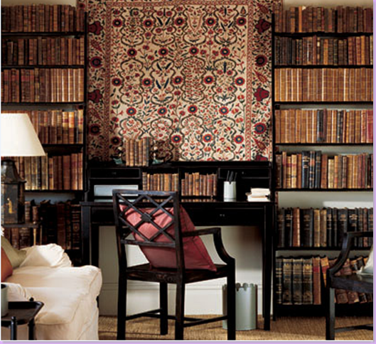
Yes, this is a catalogue and everything here is for sale.  I love the black chair and desk and the hanging tapestry, which is actually a piece of fabric.


Snap22

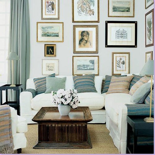
Here is their large slipcovered sectional sofa.  All of their sofas are slipcovered.   Great coffee table.  But the hanging prints make this picture, and no, the prints are not for sale!


Snap27

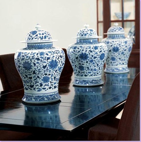
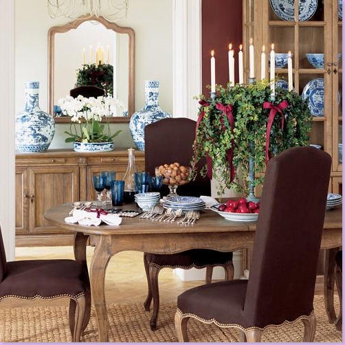
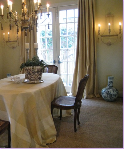
Here is a French inspired oak dining room table.  In the back are fabulous, huge blue and white oriental pieces.


Snap29

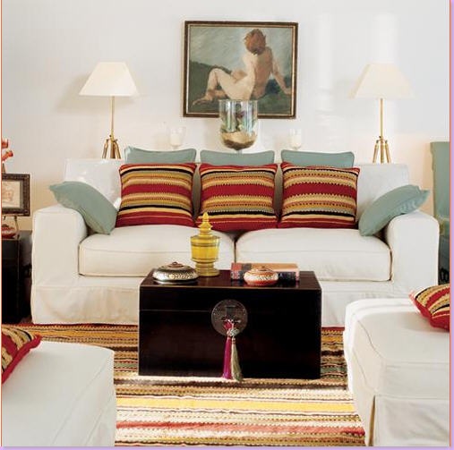
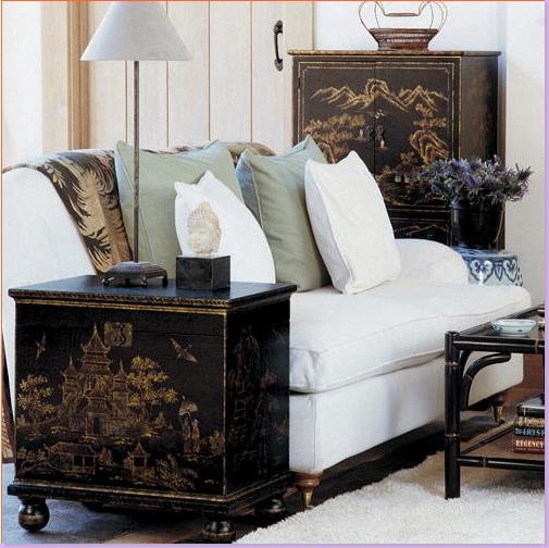
I love the nude oil painting in a catalogue picture.  Pottery Barn would never do this!!!  Note the icy blue pillows mixed with the bright colored "cushions" as the English call their pillows.   Love the black, oriental trunk used as a coffee table.


Snap30

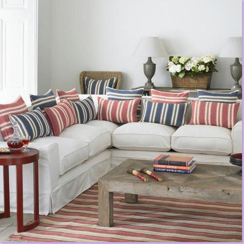
Here, red and blue ticking striped pillows steal the show.  Love the red table to the left.


Snap32

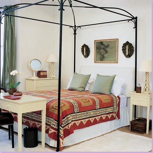
Typically English - textiles used as bedspread.  Note the seashell candlelit sconces.  The lattice lamps are bestsellers of OKA Direct.


Snap7

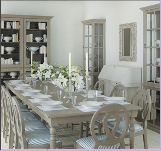
Gustavian styled dining room furniture.  I adore the cabinet in the back with its chicken wire doors.  Why can't we get inexpensive gray painted furniture like this in America?  Someone could make a killing manufacturing this here.


Snap20

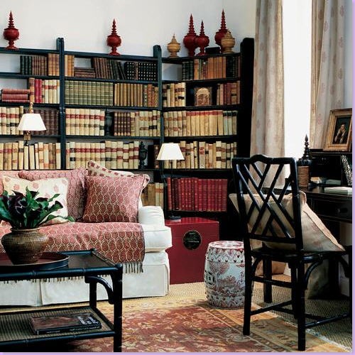
So English:  oriental rug layered over seagrass.  Paisley textile layered on the sofa.  Jammed bookcases.  Black painted furniture.   Garden seat and red oriental trunk.   The accessories on top of the bookcase are for sale.    Love this room!


image

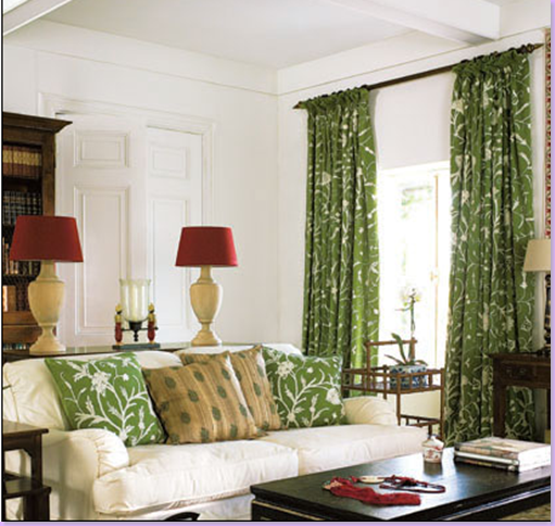
Matching pillows and curtains for sale.  The red lampshades pop the room's already bright colors.


image

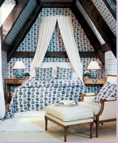
OKA Direct sells this indianne styled fabric in yards and bedding.  Note the French chair and ottoman.  Again - why can't we get great, French-styled furniture on the cheap here? 


image

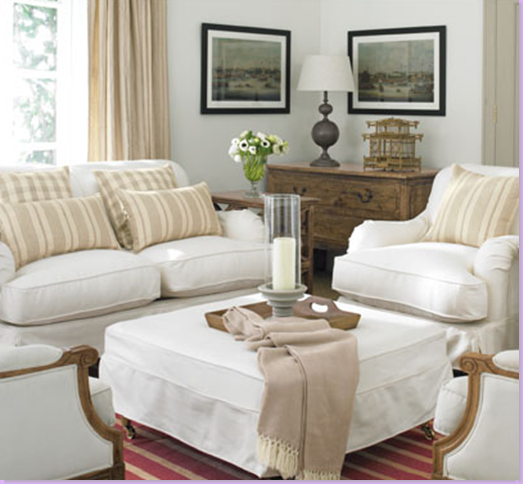
Slipcovered furniture with wonderful, huge matching ottoman. 


Snap18 

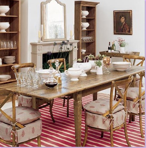
French styled dining room table and chairs with slipcovers that turn ordinary seats into something special.  Red and white dhurri rug also comes in blue and white. 


Snap19

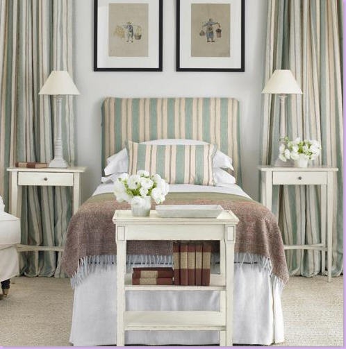
Matching headboard and drapes and bedding available. 


Snap24

I adore this piece of furniture.  The price is so low - you can buy two, one for each side of the fireplace.


Snap4aaa

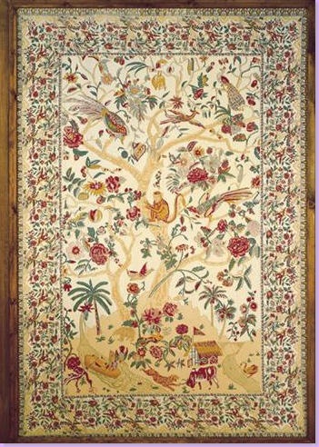
Hanging textile - Tree of Life pattern.  Love this!  When have you ever seen something like this for sale in America?


image

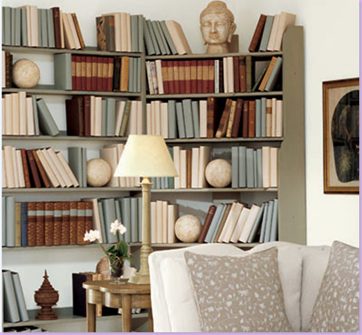
Book cases for sale  - I adore the way OKA Direct styled this with books covered in manilla paper.  This is a great way to unify desperate books in a decorative way.   I have never found the willing client to do this though!  Notice the large concrete balls used as book holders.


image

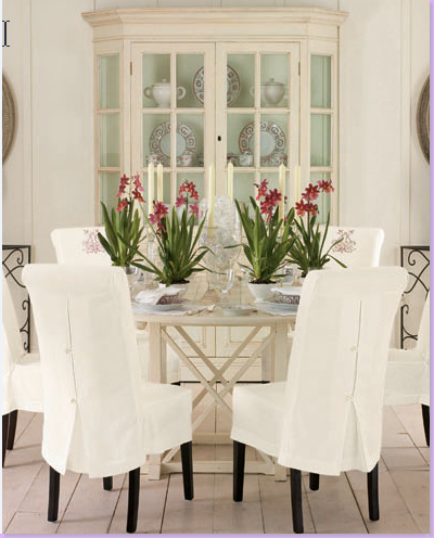
I love the detailed button closure on these slipcovers.  Great painted china cupboard in the back.


Snap23

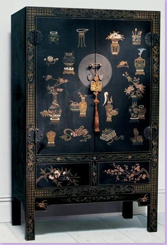
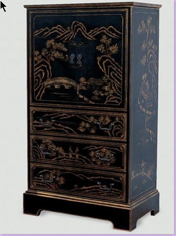
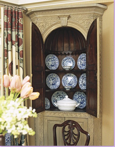
Another inexpensive chinoiserie styled cabinet.  Again - a lot of look for not much cash.  A great way to get this look until you can afford the "real" thing.


Snap34

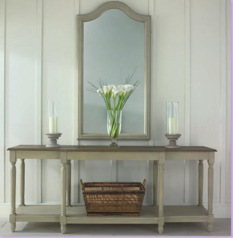
Gustavian styled console and mirror.  So pretty.


Snap28

Love this!!!!  A corner of a room showing  chinoiserie pieces by OKA Direct. 


Snap2qq

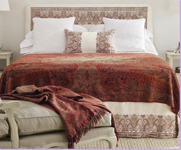
Only the English know what to do with a paisley throw.  Here it is used as a bedspread.  Notice the french styled chaise lounge on the left - this is another great piece by OKA Direct.

30.5cm Dia. Large Dinner Plate

Oriental dinnerware.   These  fabulous plates are available along with salad, soup bowls, etc.  from OKA Direct.


5-kitchen-otm-hutch-kit0607-xlg

This is a picture of Californian interior designer Michael S. Smith's own breakfast room.   He uses the OKA Direct oriental plates for everyday dishes and claims the dishes are some of his favorite styling pieces.


027

 Cote de Texas' dining room - on the right on the floor is one of a pair of OKA Direct large blue and white oriental jars.  I ordered these and they were delivered about a month later.  It was almost as easy as ordering stateside.  The only difference was after the order was place, I had to confirm it several days later before it was shipped out. 


What is your favorite catalogue?  Do you know any that are relatively unknown that you would like to share?


Dormitorio rockero en colores oscuros


Los Black-Eyed Pease Suite en el Hard Rock San Diego

Los Black-Eyed Pease fueron los invitados de honor en la apertura del Hard Rock Hotel de San Diego. El diseño de La suite refleja cada el estilo de cada miembro y toques personales con tonos oscuros para la decoración.

viernes, 23 de mayo de 2008

Alidad and Chelsea Editions


image

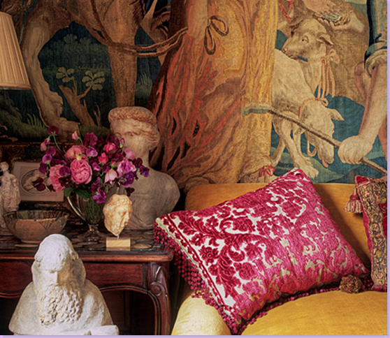
Close up photograph of an Alidad designed room.


Chelsea Editions, the England based fabric and furniture company recently announced that both Robert Kime and Alidad were joining their ranks with a new line of embroidered fabrics.   While no mention of the Robert Kime partnership has yet made it onto Chelsea Edition's web site, the Alidad association is now online to be viewed.

The one name Alidad, Persian born and London based, is known for his classic, opulent, and sometimes over the top interiors.   He started his career as head of Sotheby's Islamic Works of Art department before turning his energies to interior design.  Alidad quickly became famous for his richly decorated rooms, which often have a masculine leaning.  Always gorgeous, his interiors are laden with luxurious fabrics and textiles and  layers upon layers of richly textured patterns.  Minimalism is not a term that Alidad has any knowledge of.  Every surface in an Alidad designed room is addressed and is either fauxed, papered, or  upholstered.   Only the most fortunate few can afford the sumptious luxury of an Alidad interior. 
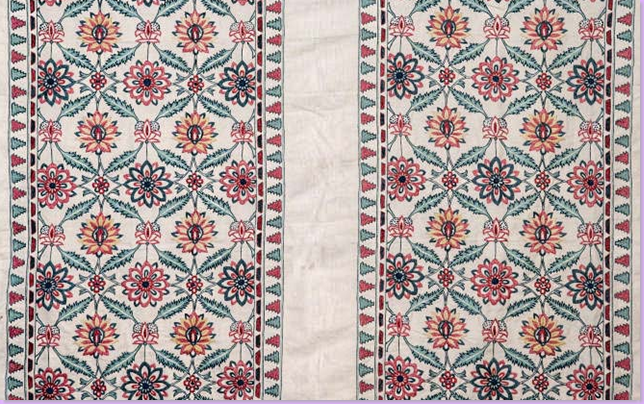
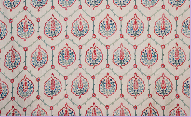
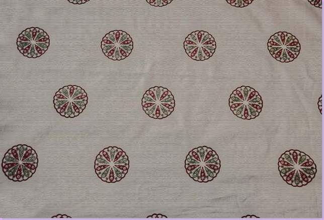
As such, Alidad's association with Chelsea Editions comes as somewhat of a surprise.  Chelsea Editions is famous for their soothing toned checks and stripes and their extensive collection of Indian hand embroidered fabrics with butterflies, flowers, and vines stitched in mostly muted tones.  Hardly the stuff of the velvet damasks and  silk brocades that Alidad prefers to use.   But, being a Persian, Alidad has remained true to his roots and his obvious love of Ottoman design, art, and textiles.   This love influenced his fabric range for Chelsea Editions.   Called "Bosphorous" - his embroidered fabrics have been scaled down for today's interiors, and their colors are muted so as to mix  with antique textiles.  Additionally, Alidad placed the patterns between stripes - perfect for wallcoverings a la Michael Smith's famous Urban Outfitter's Indian Bedspread Room.   With names like Goli, Layla, Cyprus, and Naz, the influence of the Ottoman empire on the fabrics is hard to ignore.  Here's a sneak peak at a few of the new Alidad designed Chelsea fabrics.  Hopefully - we'll get a glimpse of Robert Kime's new collection soon:


Saz

image


image

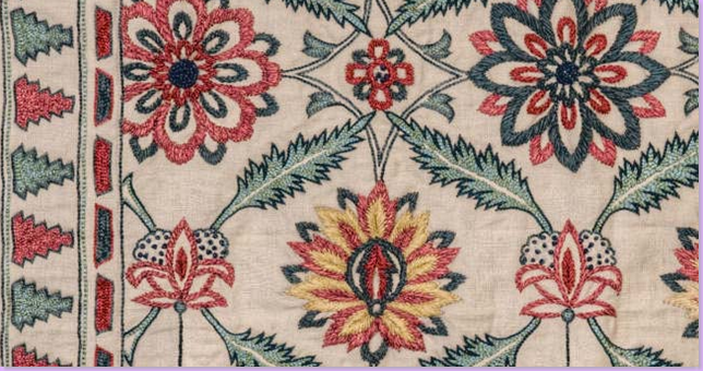
A close up look of the embroidered detail of the Saz fabric.

Shayla:

image

Pari:

image


image

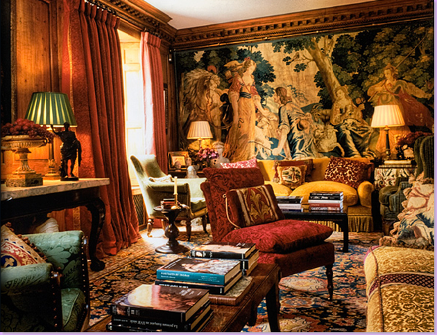
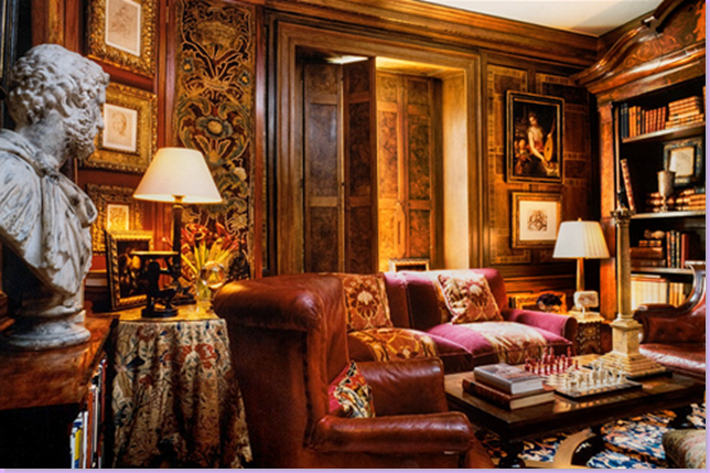
An Alidad designed drawing room:  layers upon layers of opulent excess.


image

The same drawing room - with a view to the fireplace and bookcases.


image

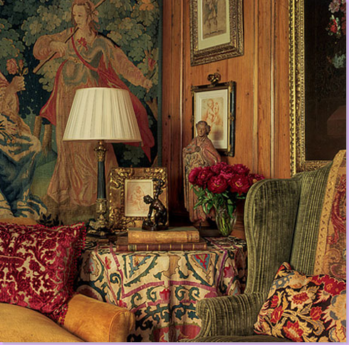
An antique suzani from the 19th century was used for a skirted table.  In just this small corner, it's interesting to see how many patterns and textiles Alidad used.  Every square inch is touched by his hand.


image

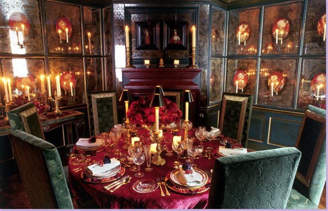
In this famous Alidad dining room, he illuminated Verre églomisé panels on the walls to give the room  a romantic candle lit effect. 

.image

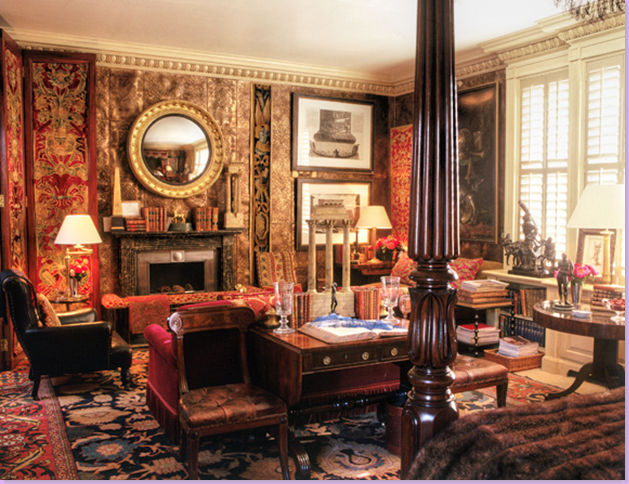
For a gentleman's bedroom retreat, Alidad used hand tooled leather panels on the walls.


 image

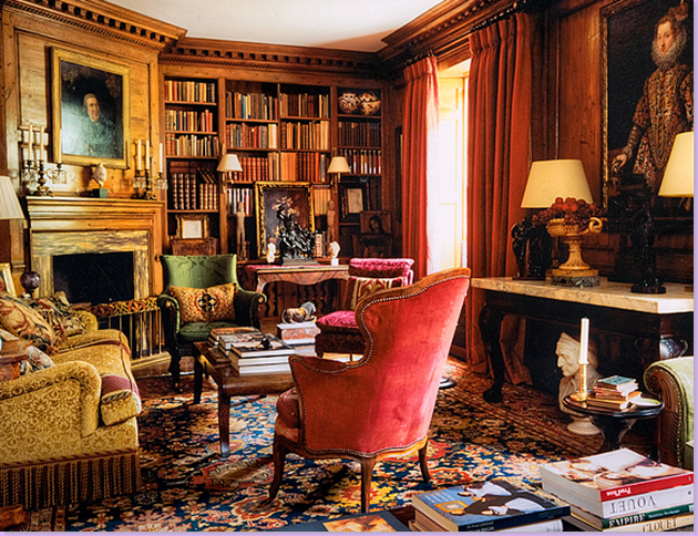
For this paneled library, the wooden walls were too plain for Alidad so he designed faux painted panels to simulate an inlaid effect.


image

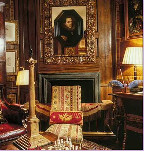
A closeup of the same library's fireplace:  Alidad placed a painting over an antique mirror.  Layers upon layers are always used to achieve the lush richness of his interiors.


image

For this listed estate, Buscot Park, Alidad was hired for his knowledge of history and the sensitivity he brought to the project.


image

Beside Chelsea Editions, Alidad has designed a line of fabrics for Pierre Frey.   Here, a multi patterned fabric is laden with the typical Alidad attention to detail and luxury.


image

Another Pierre Frey fabric by Alidad. 


image

Additionally,  Alidad has designed a line of velvet covered furniture for  Thomas Messel.   Here - a bookcase covered in red velvet and nailheads, with black paw feet.


image

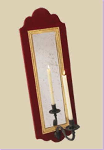
A candle lit sconce in red velvet.


image

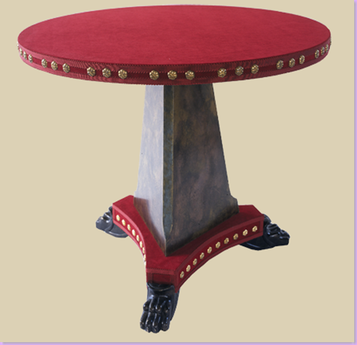
And, lastly, a round hall table with the same details as above.


image

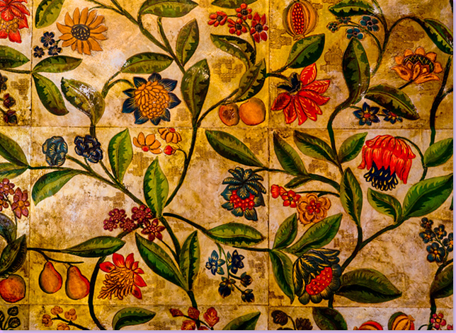
Of course, he also designs wall coverings - here a close up of a leather panel called Pomegranate.


image

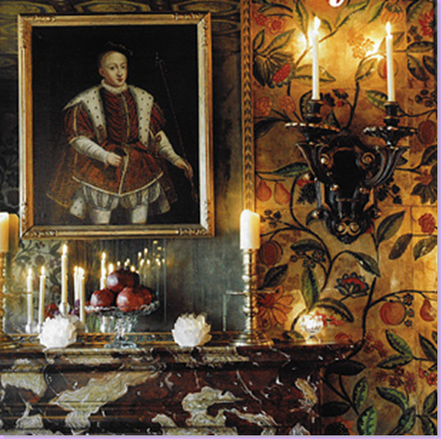
A dining room, with the Pomegranate wall covering.


image

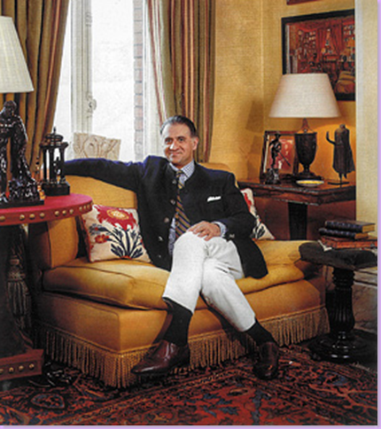
And finally - the man of  the hour:  Alidad, handsome with just an air of bemused confidence.  Notice his red velvet hall table to the left of the sofa.  The other two tables are also Alidad designed.