Me encanta la cama color fucsia y el hecho de que no es un dormitorio convencional todo cuadrado, sino que con curvas que le dan bastante movimiento e incluso espacio para el escritorio.
jueves, 31 de marzo de 2011
DORMITORIO JUVENIL CON CAMA REDONDA
Me encanta la cama color fucsia y el hecho de que no es un dormitorio convencional todo cuadrado, sino que con curvas que le dan bastante movimiento e incluso espacio para el escritorio.
miércoles, 30 de marzo de 2011
A Houston Talent
Last March, Traditional Home ran an story on “20 Young Designers We’ve Got Our Eye On.” Two were from Texas, one from Houston.
The Traditional Home Story on Julie Dodson
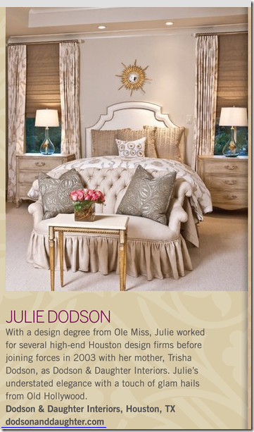
The young Houston designer given the Traditional Home honors was Julie Dodson. Dodson, a graduate of Ole Miss, worked for several well known design firms until 2003, when she and her mother, noted Houston designer Trisha Dodson, came together to form “Dodson and Daughter Interiors.” Their interiors are noted for being classic and timeless, and typically very elegant. A few weeks ago, I ran into Julie at the George Cameron Nash showroom while she was gathering fabrics together for her latest project. At gunpoint, Julie most kindly offered to share her portfolio with Cote de Texas readers. Ok, Ok, I’m kidding, but I really was very pushy! I have long admired Julie’s work which I had seen at the Pink Ribbon Showcase Houses. So, I was thrilled when she agreed to this story! I know I’ve been accused of only showing Houston interiors with white slipcovers and seagrass, but trust me, there is a lot more to Houston design than just those two design elements. As you will see, Julie’s interiors are filled with beautiful rugs, modern art work, contemporary and antique furniture, and linen, silk and velvet fabrics. Many of her rooms are filled with pieces that she designed and had custom made. Her designs run the gamut from casual to dressy, from traditional to contemporary. Looking at her portfolio, I can easily understand why Traditional Home chose Julie - her designs show a remarkably mature talent for someone in her early 30s.
I hope you enjoy these beautiful pictures, most of which were taken by photographer Julie Soefer.
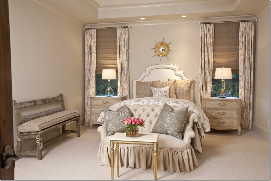
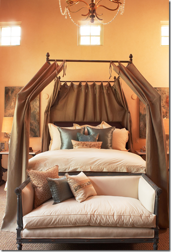
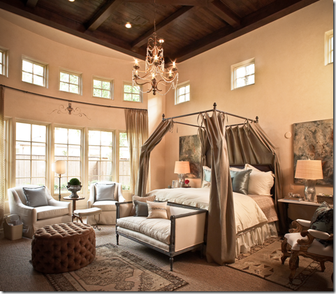
The bedroom that Traditional Home used in their article is actually a guest room. My eye went straight to the curtains and the tufted settee. What craftsmanship! I love the small rolled arms and back. Such a cute bedroom!
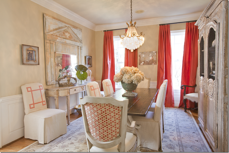
This next project is a home in West University. Julie used the client’s rug as the starting point to bring in the colors – a soft turquoise and the deep orange. Notice how she used two different chairs at the table. Also, notice the trim she added to bring in a design element to the upholstered chairs. Love the mirror!
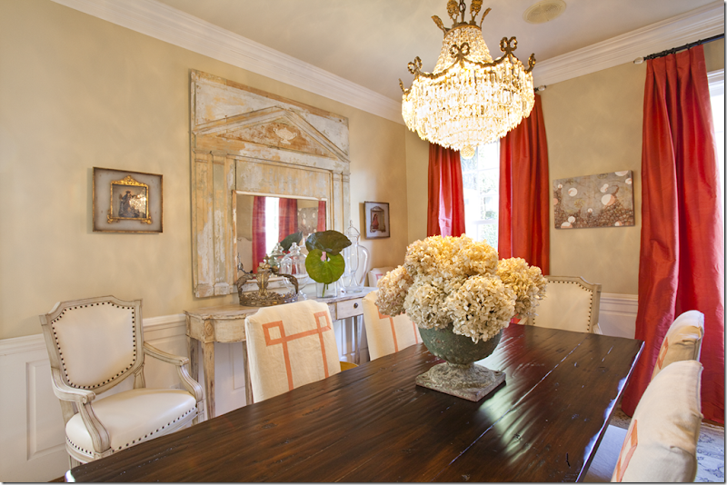
In this view, you can see the front of the French host chairs, which was kept plain in contrast to their backs.
Across from the dining room, the living room continues with the same orange accents, this time mixed with brown. Again, the art work set the room’s color scheme.
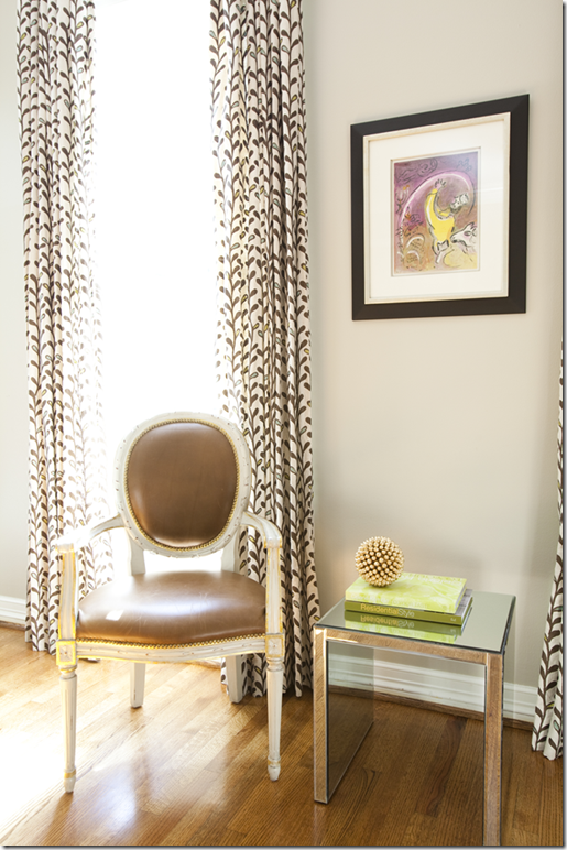
The curtains in brown and white repeat the same coloring in the polka dot pillows. Julie mixed classic with contemporary in this room – these painted chairs with brown leather are so beautiful!
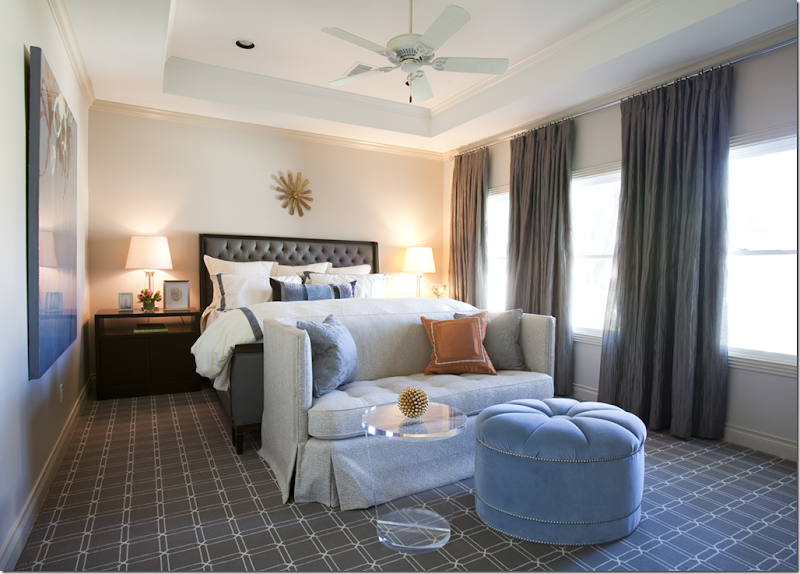
In another West University house, this master bedroom was originally done in reds. Julie was hired to update the room and create a serene environment. Here the only pattern is in the 100% wool rug from Creative Flooring. The room is large and very long, so a seating area was added to fill up the space. A row of builder grade windows are given distinction by the beautiful curtains.
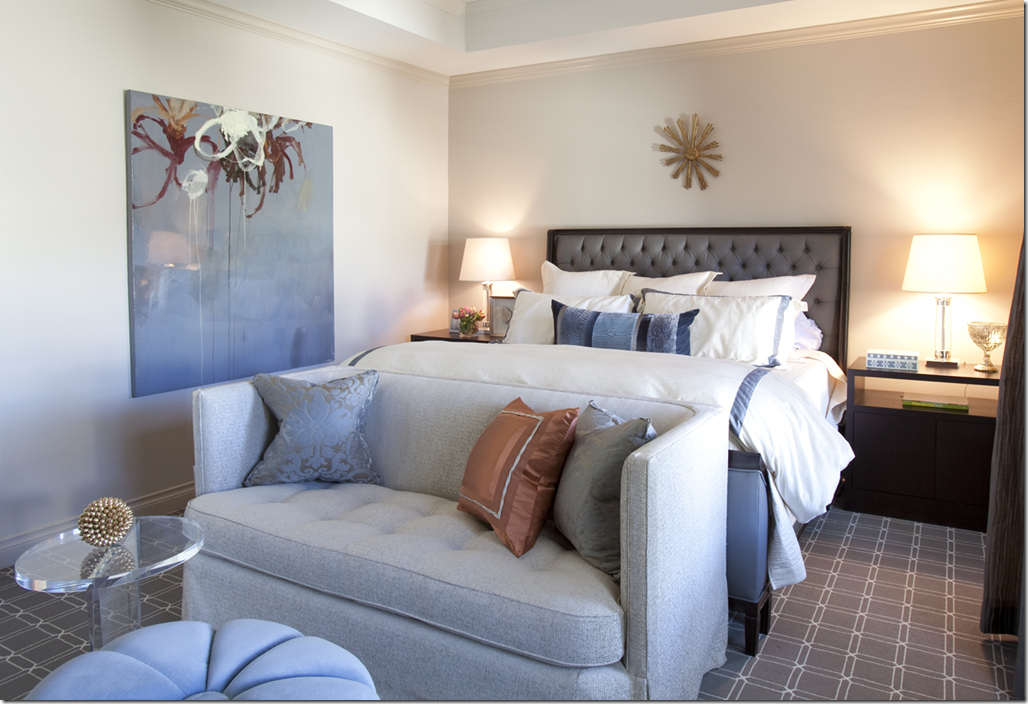
In this picture, you can see the contemporary art work upon which the room’s color scheme was based.
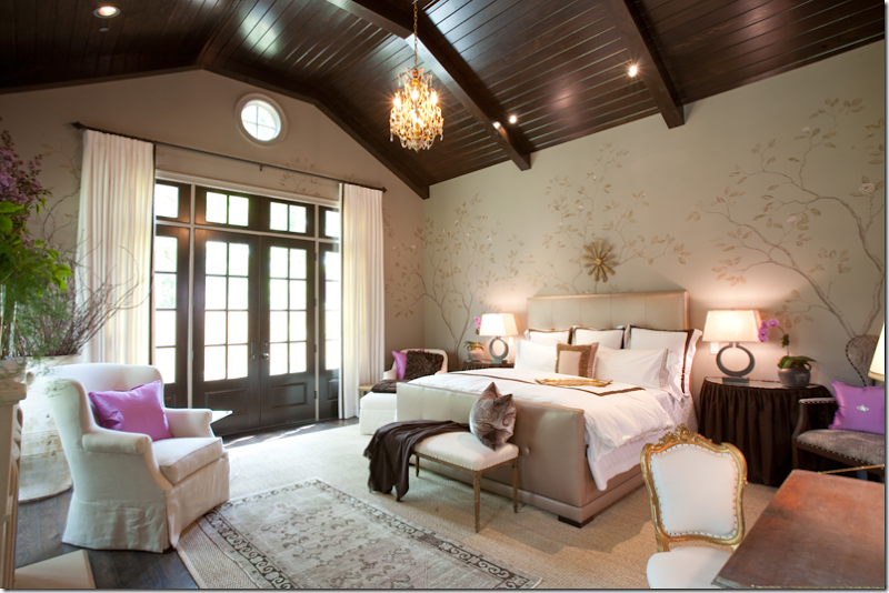
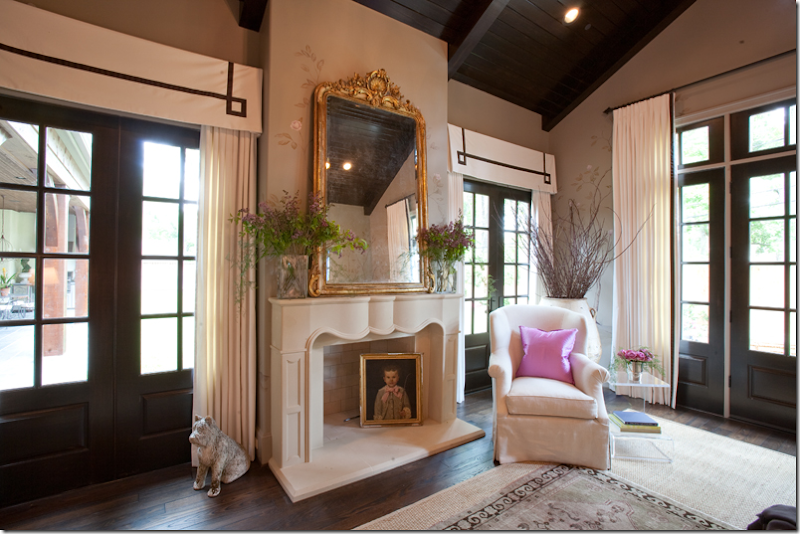
Julie was given the honor of decorating the master suite in this year’s Pink Ribbon Showcase House. Setting the tone is the gorgeous wall treatment hand painted by Segreto Finishes. Wow! It looks like Gracie wallpapering. Soooo beautiful!!!! The décor is a mix of traditional and antique furnishings.
At the windows, Julie added a soft cornice to the shorter French doors to visually pull them higher, matching the taller windows on the right. She added brown trim to the cotton twill curtains, adding extra interest. I love the touch of pink silk in the ivory chair.
The bed was designed by Julie and made by The Joseph Company. She used vinyl to cover the headboard AND the doors that lead to the bathroom. The painting over the desk was done by an artist from Segreto’s Studio.
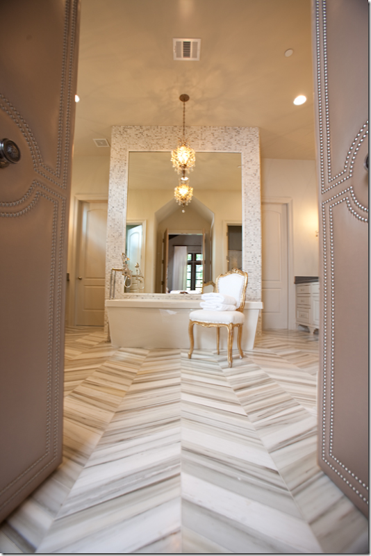
The master bathroom has a stunning marble flooring from Walker Zanger. Around the bath, the same marble is found in 1” tiles. Notice the studded door leading to the room.
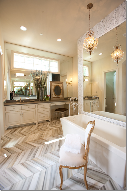
Another view of the bathroom. I like how Julie used the black countertops, picking up the darker shade of marble.
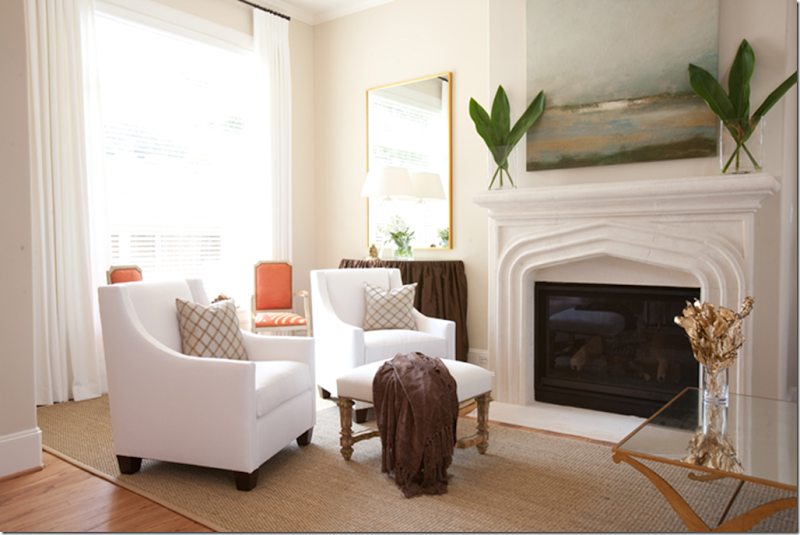
For this project, a model home on Sunset, Julie had a strict budget to work with. I love the half round skirted tables that flank the fireplace.
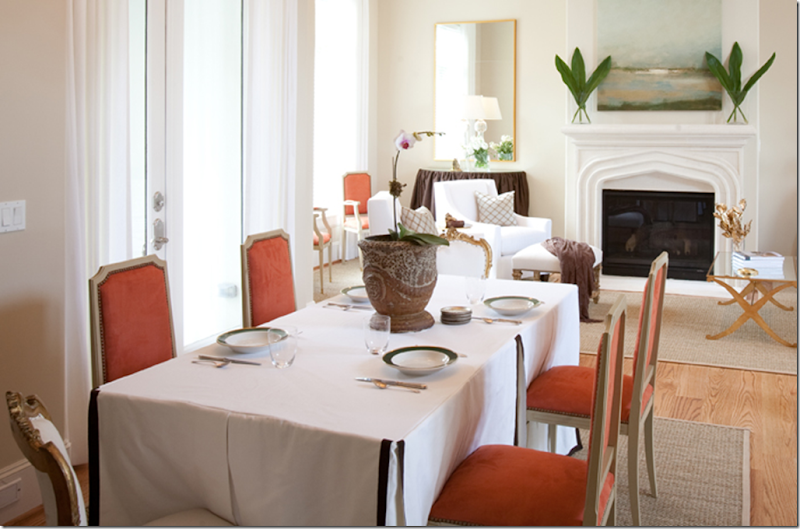
Julie lucked out with the chairs in orange ultrasuede that she found at the Guild shop. To save money on the dining room table, she used a skirt – with brown trim to dress it up.
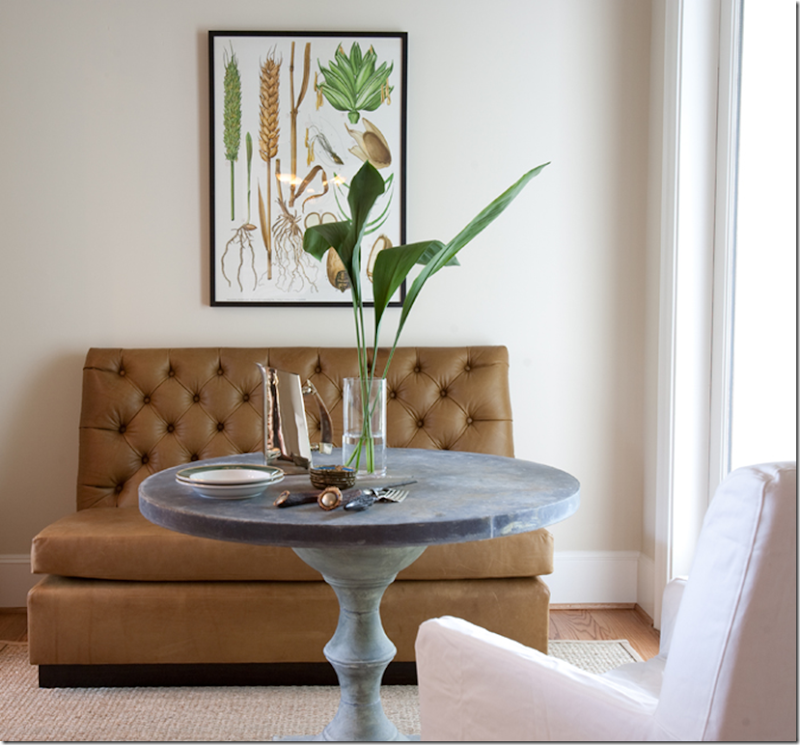
In the breakfast area, she used a tufted banquette and a zinc table.
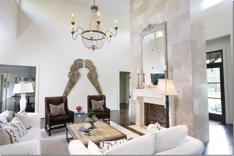
For this large custom home in Memorial, Julie chose a wool patterned rug from Creative Flooring to anchor the furniture. Again, the rug and the pillows provide the only pattern. She found the oversized angel wings in Highpoint. The Joseph Company made the custom furniture.
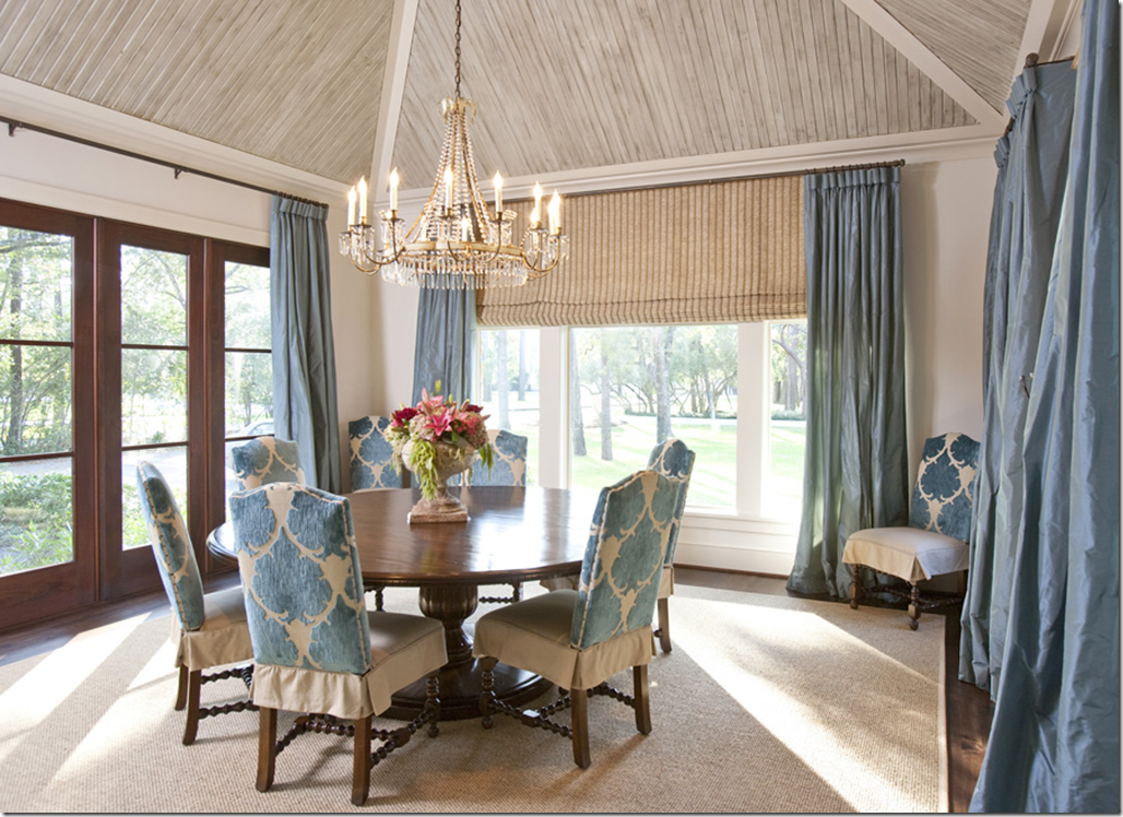
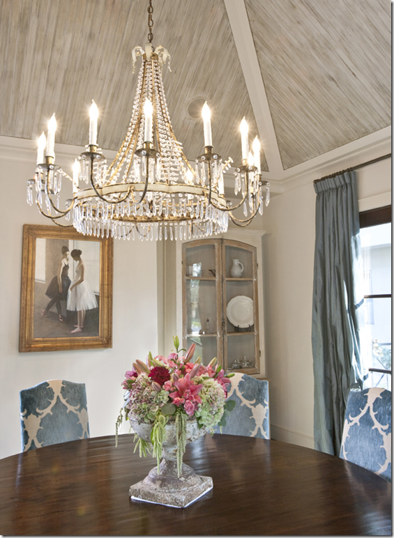
In the dining room, Julie used beadboard on the ceiling and then had it antiqued. The chairs are covered in two fabrics, the velvet is a Mokum fabric. The silk curtains are just gorgeous and perfectly match the Mokum fabric.
Above the table is the beautiful David Iatesta chandelier – one of my personal favorites! I love it so much!!!! It also comes in a celadon color and has matching sconces. HERE.
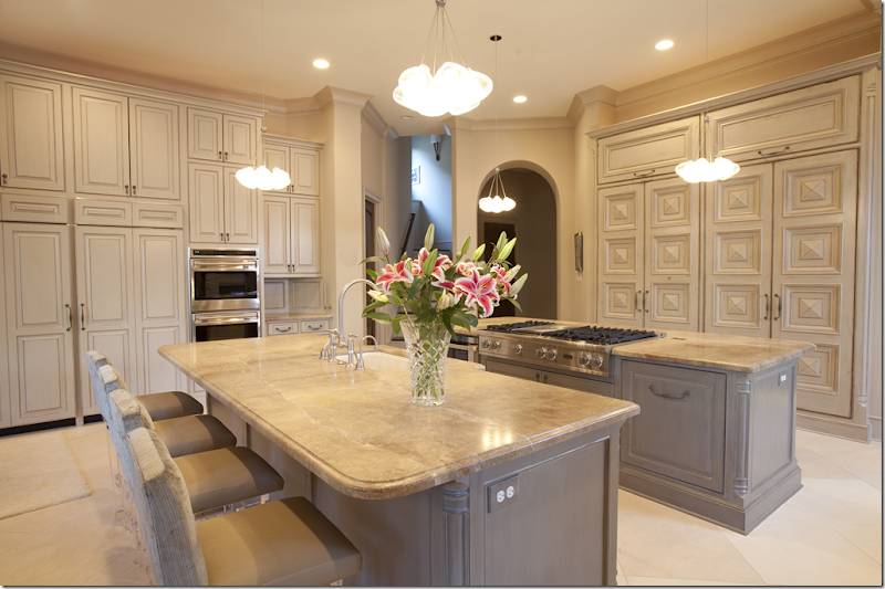
The kitchen continues the elegant feel of the house, with upholstered barstools and an area rug.
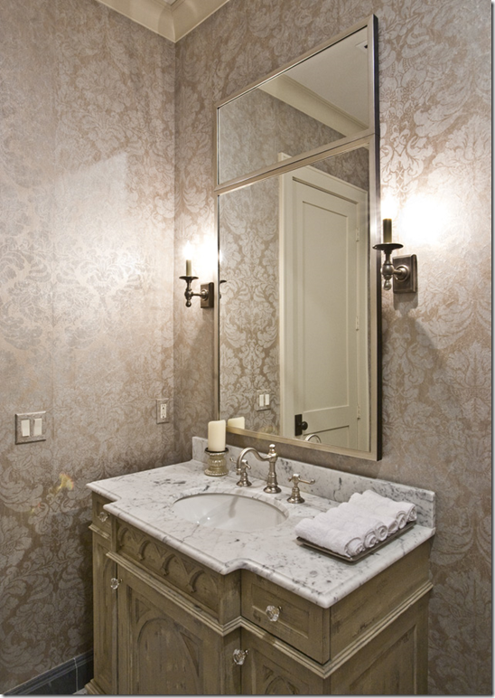
The powder room – notice the carvings on the cabinet!
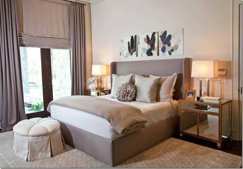
In the master bedroom, Julie wanted a quiet atmosphere with pops of color coming from the art work. The mirrored night stands add a reflective quality to the room.
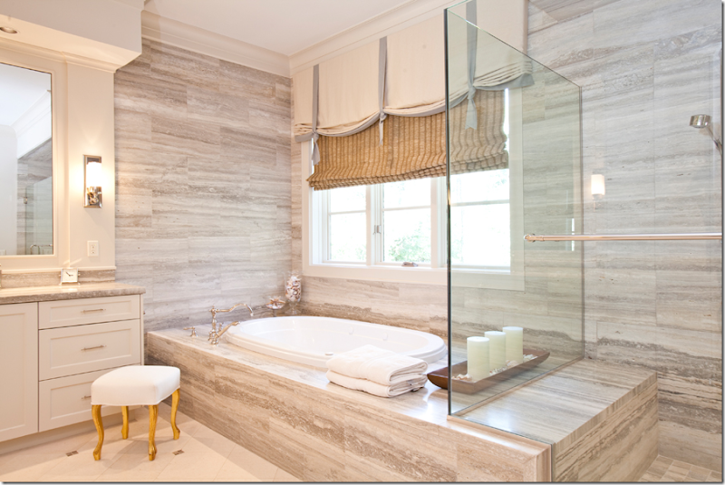
In the master bathroom, Julie used Sienna Silver, a travertine, from Walker Zanger. It creates a great linear feel to the room.
In 2008, Julie again was given the master bedroom suite of the Pink Ribbon Showcase House. Here she used an iron bed with brown linen curtains.
The bed helped bring the room’s high ceiling down to a more human scale. I really love this room with its mix of antique and traditional furnishings. On either side of the bed, she placed large pieces of art work instead of the more typical mirrors. So pretty!!!!!
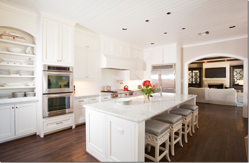
Showing that she does more than traditional interiors, Julie designed a very contemporary custom house in River Oaks.
The living area is one large room with the dining area on one side. The client’s family is large and they needed much room for entertaining. The owner requested two triangular tables which Julie commissioned Bill Peck to make. Julie took the color scheme from the owner’s art work. A user friendly vinyl was used on the chairs.
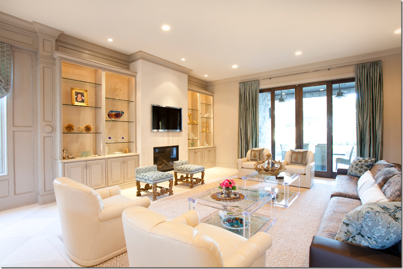
At the other side of the room is the sitting area. These great acrylic tables were custom designed by Julie and made by Muniz Plastics out of Florida.
The kitchen – notice the beautiful carpentry on the right! The barstools have acrylic legs. Great light fixtures.
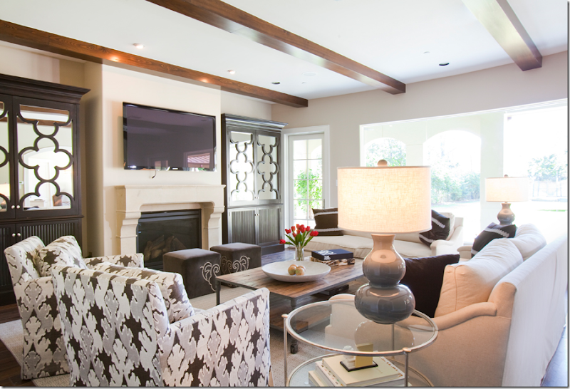
For this house, in Memorial, Julie designed the two cabinets on either side of the fireplace and had them custom made. So much prettier than the typical built in cabinets.
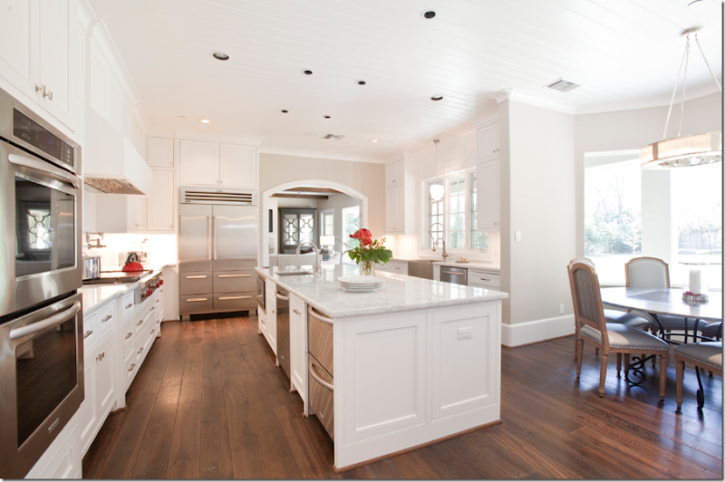
In the same house, the kitchen leads off the family room. Here, a zinc top table came from Joyce Horn Antiques and the light fixture is by Restoration Hardware.
And, another view of the kitchen shows the darling bar stools, designed by Julie and made by The Joseph Company.
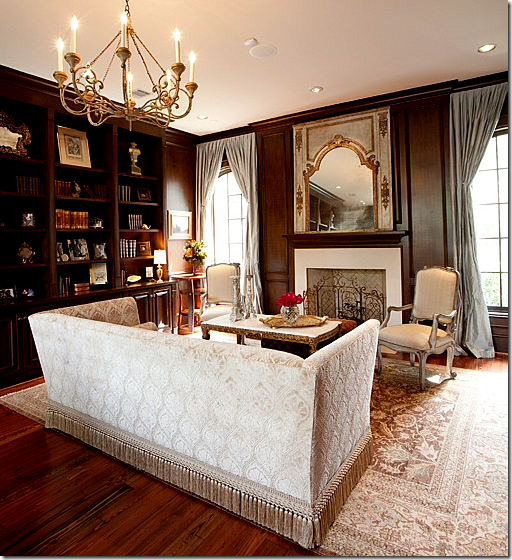
In this new construction house in Tanglewood, Julie used a rug from Creative Flooring. The beautiful silk curtains are a light blue, taken from the rug’s colors. The antique mirror came from Watkins Culver and the chandelier is by Niermann Weeks.
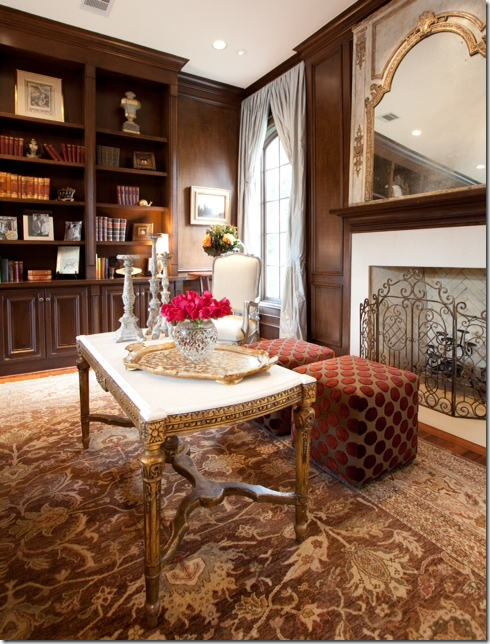
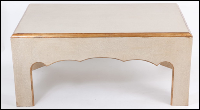
Another view of the library. I love that coffee table with its marble top and gilt legs.
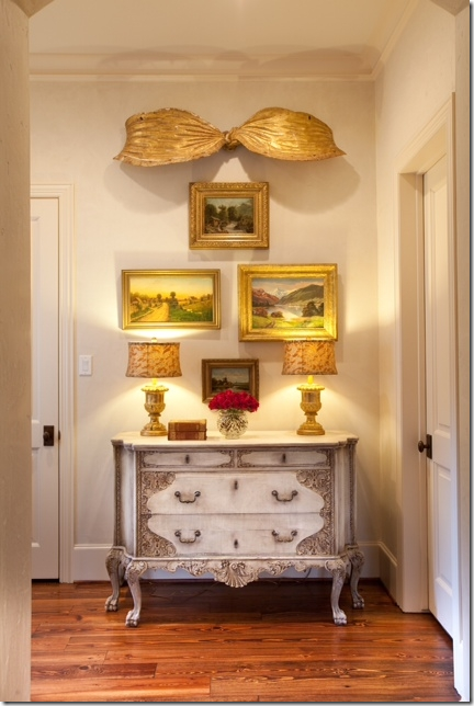
And finally, in the same house as the library, across from the family room was this open space. The owners wanted something pretty to look at and instead of buying just a mirror, Julie added art work from Cavalier Fine Arts, lamps with Fortuny shades from The Gray Door, and the ultimate – a gilt wooden bow from Kay O’Toole! I am so in love with that bow!!!! I think she did such a great job, taking an insignificant corner and turning it into a wonderful place to rest your eye. If I ever found a bow like that, hmmm….!
A special thank you to Julie Dodson from Dodson and Daughter. To visit their web site, go HERE. Julie promises some new photographs of two big projects in the near future and I can’t wait to see them! Photographer: Julie Soefer at 713.529.4700.
AND FOR HOUSTONIANS: Monique Topping returns with a house full of antique furniture:
Besides the antiques, Liz Sloss’s jewelry will be featured.
And, Kathy Slater’s beautiful coffee tables will be there too. To visit Kathy’s wonderful New Orleans shop, go HERE.
Be sure to drop by this Thursday – Saturday to see all the merchandise AND the beautiful house!
DORMITORIO TOY STORY BUZZ LIGHTYEAR AL INFINITO Y MAS ALLÁ

Mira otros bellos dormitorios para varoncitos en: DORMITORIOS PARA NIÑOS.
Via http://dormitorios.blogspot.com
martes, 29 de marzo de 2011
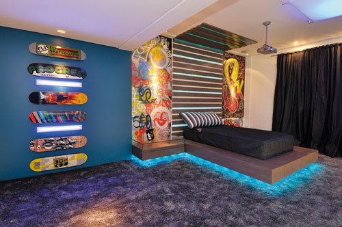
DORMITORIO PARA JOVENCITO ADOLESCENTE CON SKATES Y GRAFFITI
lunes, 28 de marzo de 2011
SOLUCION PARA DORMITORIOS CON TECHOS BAJOS
Si tienes un dormitorio con techo bajo, busca un espejo de pié y apóyalo contra la pared. Además de hacer que el cuarto parezca más grande y luminoso, el espejo inclinado contra la pared hará que el techo parezca más alto.
Via: http://dormitorios.blogspot.com
While I Was Sleeping…
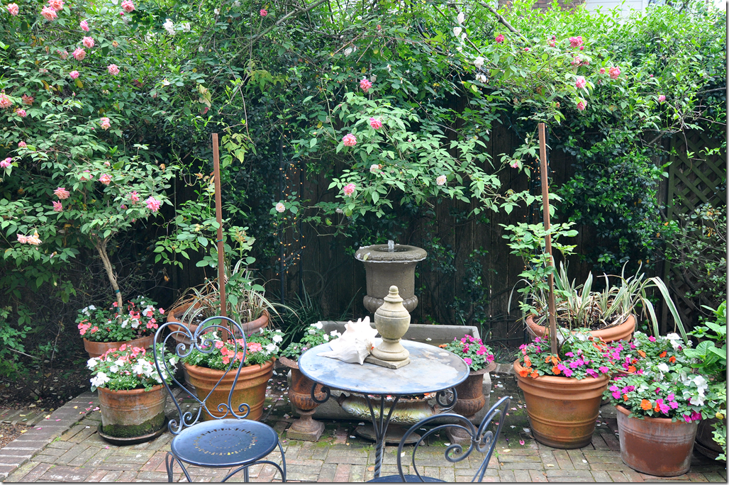
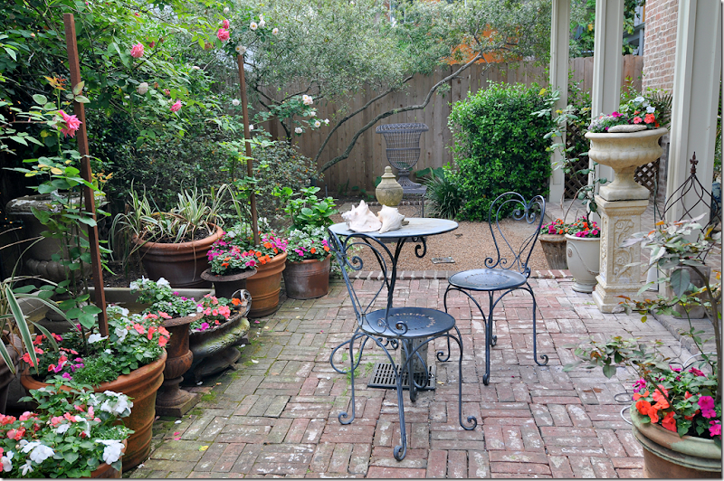
The roses have been busy. I was late to take notice that spring has exploded in my back courtyard. It seems as if it happened overnight. This past winter was extremely cold and that accounts for all the profusion of flowers – the azaleas look incredible and I suspect the bluebonnets have turned the fields along the back roads leading to Round Top into a sea of purple.
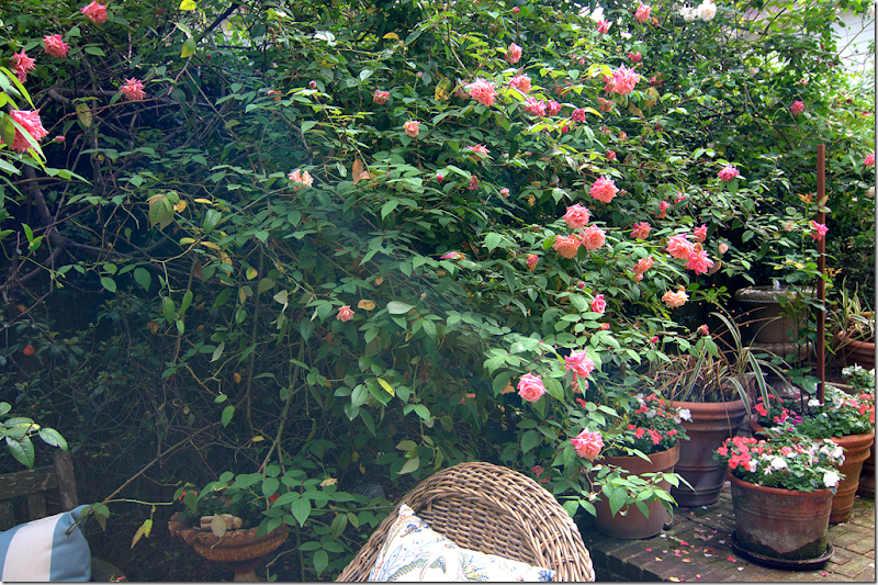
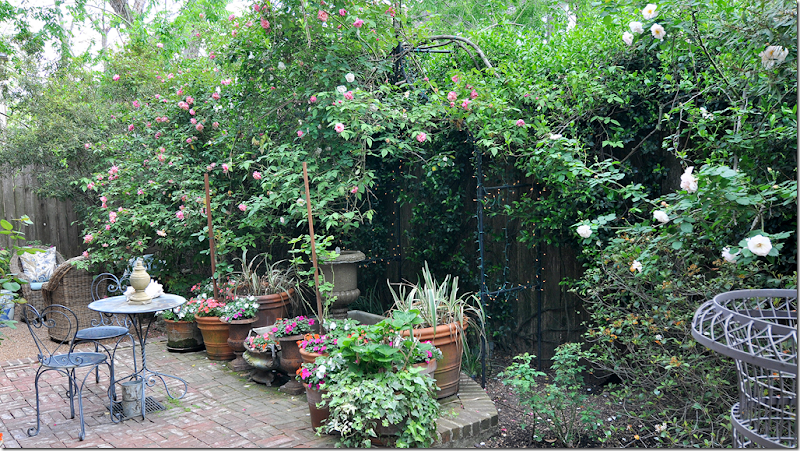
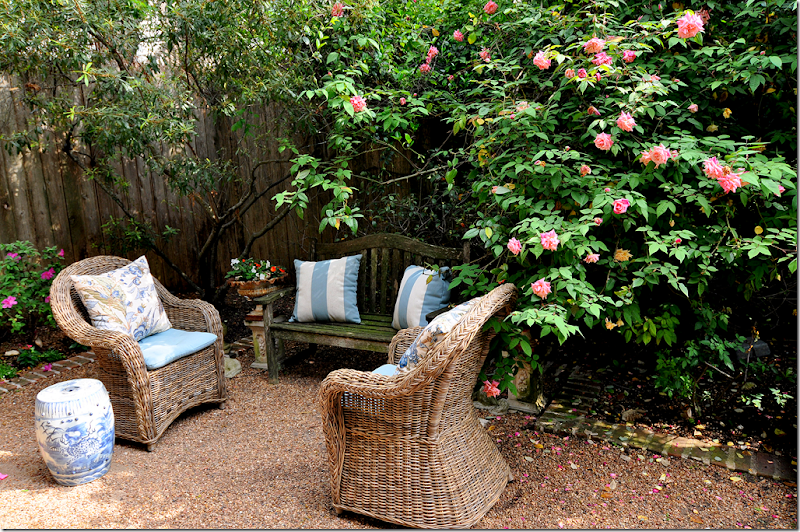
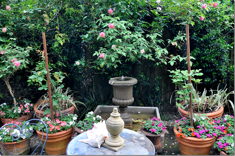
In my courtyard, the three rose bushes from The Antique Rose Emporium in Independence, Texas, have completely overtaken my back fence. I planted these bushes about 15 years ago. The antique climbers quickly grew to full height, around 15’, arching out over the gravel courtyard in a magnificent display of dark pink and creamy white roses. Until one day that is, when I came home to discover the Rose Tenders crew had cut the bushes back, taking off about 8 ft. of limbs. I can’t recall ever being so angry and upset over a flower before. Irate too at the stupidity of “pruning” an antique climber. It’s taken years for these bushes to reach back to their full height again, and even then, they have never achieved that weeping, arching effect. I’m waiting for that, maybe next year, or the next. And yes, I did break down and buy the Kooboo chairs. It’s a story for another day – lots of changes going on inside my house which I hope to show you soon.
There are two bushes of these pink roses. One on the left side, and one in the middle right over the fountain. The pink roses aren’t particularly fragrant but that’s ok. The creamy rose makes up for the scentless pair.
It seems as if the rose bushes grew several feet overnight! The amount of their growth this spring has been incredible. Because of this massive growth, the iron trellis over the fountain can barely be seen now. Only the twinkly lights alert you to the fact that there is indeed a trellis there.
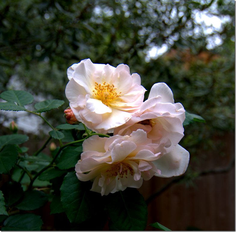
The creamy white roses are on the right side of the yard. This variety isn’t nearly as tall or full as the pink. I should have planted all three bushes the same variety – but at the time, I had no idea I was making a landscaping decision that would be here 15 years later!
The freezing winter caused a lot of damage around town. I lost two potted trees and all my variegated ivy is gone. The pots were filled this week their summer plants and all the beds have been cleaned out and planted with green and white caladiums, whose ears should start peeking out soon.
I wrestle with the landscape design. Some days I love the cluttered English style garden with masses of roses and ivy everywhere. Then there are days when I want the stark green only garden with box and zinc pots and lots of succulents. One day…. if I ever have room for both kinds of gardens, that might happen. Right now the English look is winning.
Unfortunately, I don’t know the name of the rose varieties, but it really doesn’t matter. All of The Antique Rose Emporium varieties are perfect. Go HERE to read my story about The Antique Rose Emporium. Go HERE to read their web site.

