This next kitchen in our series comes from reader Susie Bohnsack, who has an interior design service – Pearhouse Designs - HERE. Although Susie lives in New Jersey, her town, Delran, is actually a suburb of Philadelphia. The kitchen shown today was completely gutted and expanded – it originally was 25 x 10, but an additional 19 x 6 was added on. It’s a stunning redo that I think you will really enjoy!
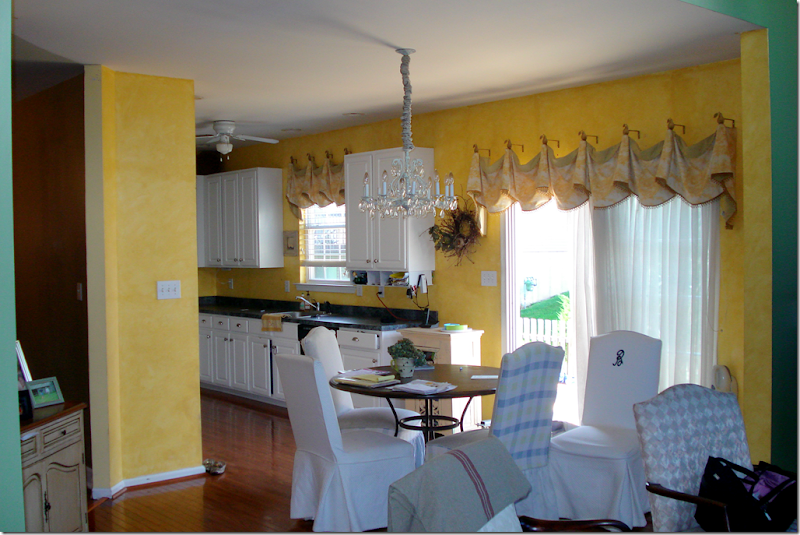
Here is the original kitchen – all bright yellow. Where the chairs are located, in back of the table, is the family room, which has a very high ceiling.
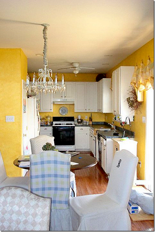
The kitchen was originally U-shaped. The counter on the right is where the kitchen was bumped out 6 ft. Here is what it looks like today. Are you ready?
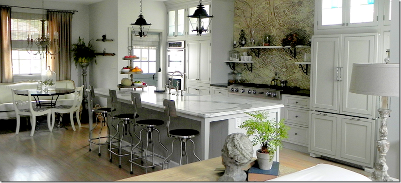
Yes, this is the same kitchen – with an extra 6 ft on the right and 19 ft long. Wow. I told you it’s an amazing difference!!
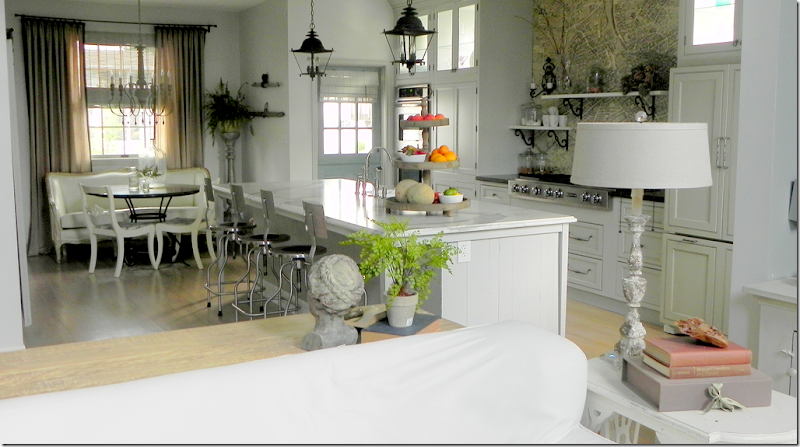
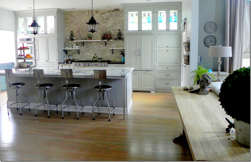
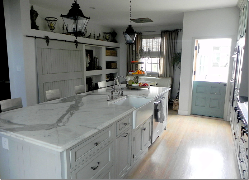
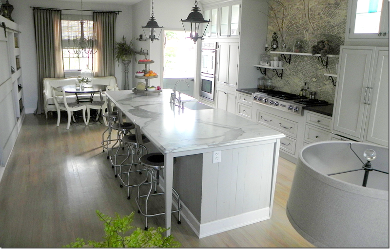
Backing up a bit, this picture was taken in the family room looking into the kitchen. The island is a very large 10’ x 4’. Susie searched a long time to find a Calacutta Ora slab, but gave up when instead, she fell in love with this honed Statuary marble slab with its striking veining. The pieces of slab left over were cut to make the shelves over the cooktop. The island is clad in old barn wood flooring that was leftover from one of Susie’s job. She saw the bar stools on the blog, Velvet and Linen, and its writer Brooke Giannetti provided the source – a medical supply company! The entire kitchen flooring is hardwood, stained a much lighter color than it was before.
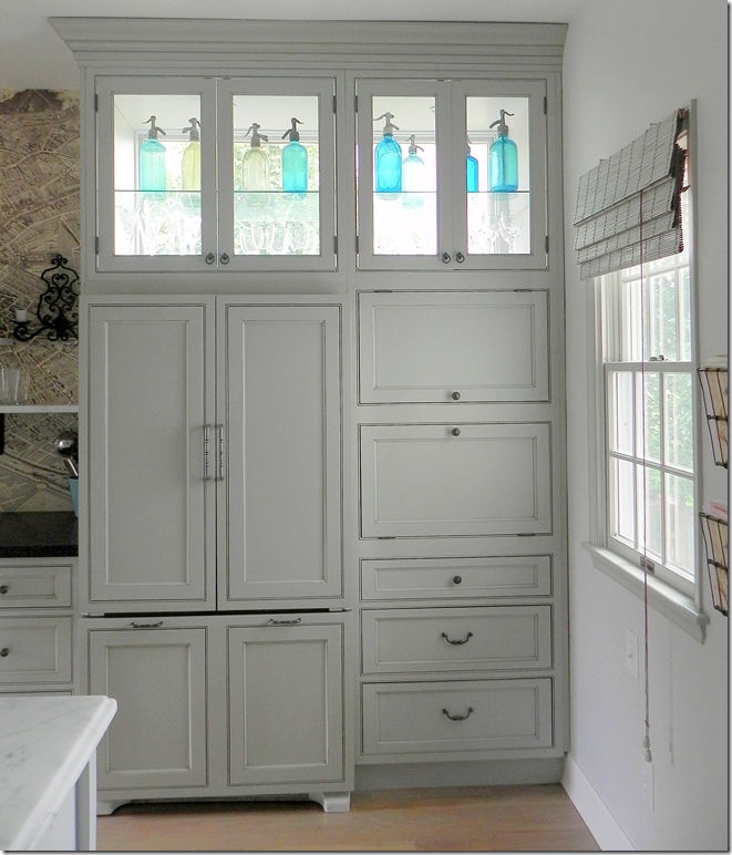
Susie wanted the kitchen flooded in light, but the neighbors are close by. The solution was to install windows behind the custom cabinets on the back wall. Light now streams in from three sides and their privacy is preserved. The turquoise found in the antique seltzer bottles is repeated in the Dutch door at the left, which is also painted turquoise.
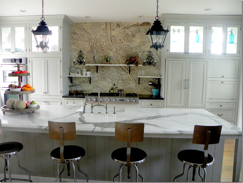
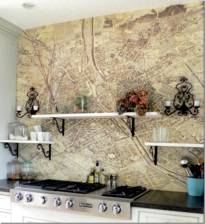
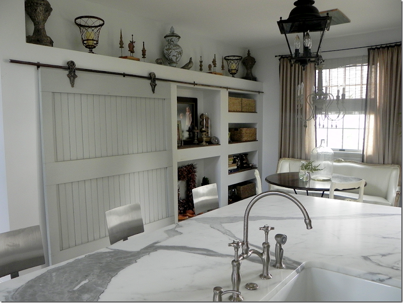
One of the more unusual details in the kitchen is the Turgot plan de Paris map found above the cooktop. Susie says she had first seen the map on a blog and ordered it – all 24 sections of it. It was installed with wallpaper paste and several coats of poly. If Susie ever tires of the map, it can easily be replaced and tiled instead. In this picture you can see close up the medical supply bar stools and the beautiful veining of the marble. Also, you can see the wood flooring that was used to clad the island. For information on obtaining the map, see Pigtown Design’s story on it, HERE.
The refrigerator is hiding behind these custom cabinets. To the right of the refrigerator are more hidden things…
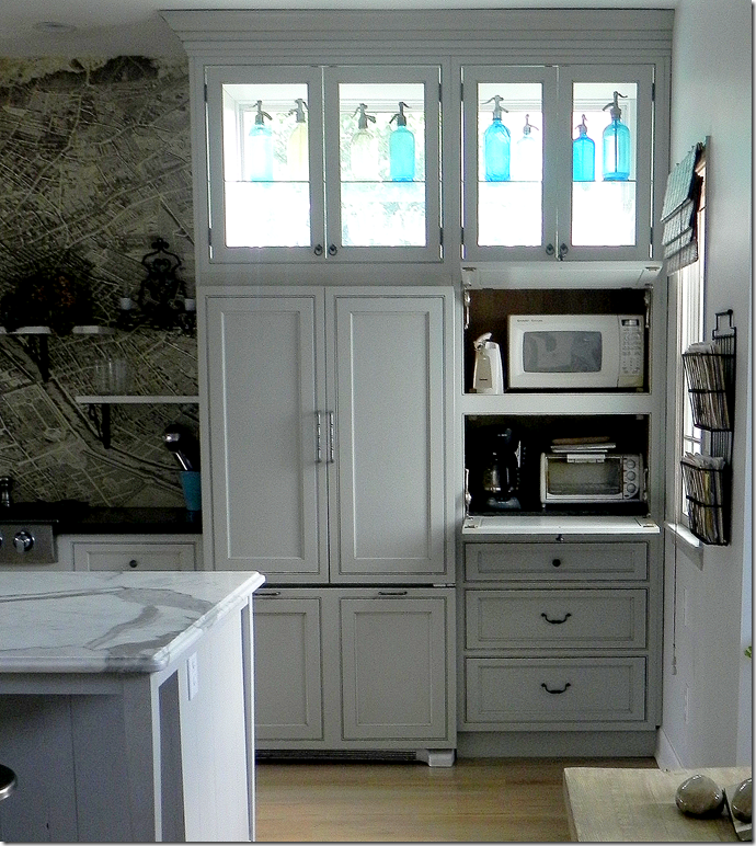
Here, behind doors that swing up, are the microwave, toaster and coffee pot. The door when pulled down actually provides the work surface for the appliances. Hiding all of these frees up the countertop of space and clutter.
A closeup of the Paris map and the marble shelves. The sconces are vintage French and the brackets came from E-Bay.
Looking towards the side door is Susie’s Italian Greyhound, Luna. Since growing up with a Dutch door, Susie really wanted one and found this old one which she refinished – painting it Turquoise to match the seltzer bottles. Susie says the only problem with Dutch doors is there is no screen.
Looking across the island is the pantry – hiding behind an old barn door with its original track and hardware. Susie says she loves the sound it makes when the door rolls open and she can always tell when the children are sneaking a snack! From this view, you can see there is a farm sink and two lanterns from Troy Lighting which brighten up the island. The lanterns are actually for the outside – which is a great way to go when buying lanterns. For some reason, most made for the outdoors are less pricey than those made for the inside.
A closer view of the pantry with the built in shelves to its right. That marble slab is sooo gorgeous!!!
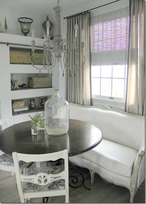
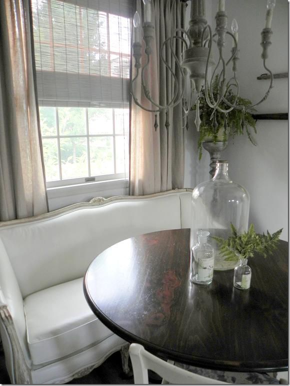
Next to the pantry is the breakfast area with an Aidan Gray light fixture.
Susie found the antique French settee upholstered in a “hideous pink damask that looked like it had spent many nights in a frat house.” Besides the fabric, it was painted tan. She sanded it down to the original gilt and natural wood. Next it was upholstered in white leather – a great alternative to slipcovers and a great idea for kids! Susie says she wants to replace the table with a more industrial one. The chairs, her grandmother’s, will be replaced with Kooboo ones to bring more texture into the kitchen.
The view looking from the breakfast area into the family room with its tall ceiling. I love the limed wood console table that divides the two spaces.
This picture, taken with the lights on, shows up the colors better – especially the Dutch door and the linen curtains.
Susie, thank you so very much for sharing your beautiful kitchen with us!!!
To contact Susie Bohnsack, see her web site Pearhouse Designs HERE.
sábado, 10 de septiembre de 2011
Readers Kitchens Series #4
Suscribirse a:
Comentarios de la entrada (Atom)



No hay comentarios.:
Publicar un comentario