Continuing with the series Readers Kitchen, today we have a newly remodeled one to show. Enjoy!
BEFORE: This kitchen had lots going on creating a busy looking design. Elements that added to the business include: dark wallpaper, ivory countertops mixed with the dark stone topped island, and a collection of brightly colored roosters. More business comes from the angled wall – with three arched windows. While the wallpaper seems dated, I do like the painted beadboard island and the tumbled tile backsplash. But, the homeowner wanted something totally different – something quieter and more sophisticated.
AFTER: Wow, it’s hard to believe it’s the same space. It looks so sophisticated now. The different countertops were replaced with granite. I love this light colored granite. It’s a great substitute for those who desire the white marble look but want the ease of granite. Granite is one of nature’s hardest stones, so it really takes a beating in a hard working kitchen. The backsplash was replaced with a cream colored subway tile, simplified from all the different sized tumbled tile of before.
In this view, you can see the angled wall with the three arched windows. All the appliances were stainless before, so those didn’t need to be changed. Nor did the cabinetry. Not changing out these two things was a huge savings in the overall cost of the remodeling. The biggest change after the countertops is the dark painted walls, replacing the even darker wallpaper.
Looking from the breakfast room, another change is the wine rack above the refrigerator was removed and a flatscreen was placed there instead. Over the island, a wooden Italian styled chandelier was added. This one looks like it might have come from Aidan Gray – they make a number of these in several different styles. With all the roosters gone, the kitchen is sleeker looking and less country.
Another big change was the addition of the farm sink with a new plumbing fixture. New pulls – a combination of round and bin pulls were added. In this picture, you can see the granite up close.
Along the back wall, the butlers panty was updated with the granite and subway tile.
This view shows the adjoining breakfast room.
A few last changes are the counter was extended in between the kitchen and breakfast room, allowing for bar stools and the row of small shelves next to the counter was removed – further streamlining the look.
This kitchen was certainly usable and not that dated in the before picture. The main problem was the dark wallpaper which made it seem like it was designed in another decade. The homeowners probably could have just replaced the wallpaper and called it a day, but they went a step further and replaced the Corian with granite and the tumbled tiles were replaced with subway ones. These changes made a huge difference in the design. Luckily, the appliances and the cabinetry didn’t need replacing, which kept costs down. The only changes to the cabinetry were the removal of the wine rack and the small shelves that ran up the wall in between the breakfast room and kitchen. The sink was a costly change, but again it really updated the kitchen and ties it in with the beadboard island. Finally a trendy light fixture is an unexpected touch, yet it adds to the new look of sophistication in this once busy, but now much quieter kitchen!
A huge thank you to the homeowner who graciously agreed to share her new, beautiful kitchen with us!
More Readers Kooboo Chairs:
I still get pictures from homeowners showing off their Kooboo wicker chairs. Not that I blame them! I like to show mine off too. Below, are two homeowners with their newly purchased Cost Plus World Market Kooboo chairs:
This homeowner used four Kooboo chairs around a gray painted table. I love the lantern mixed with it and the soft linen curtains. It’s such a mixture of textures, which creates the interest.
Looking the other way – I love the set of framed leaves.
Delores Arabian who writes the wonderful blog Vignette Design recently bought her Kooboo chairs for her breakfast room. I love the way she styled her table with the linen runner. Sooo pretty!!!!
Her house is so beautiful. She’s lucky to own two – this, her main home and her vineyard home in Sonoma. Delores is really talented and her houses show this. Her blog is very interesting – highlighting her two different lifestyles – one in the city and one in the country. If you don’t read it, you should HERE.
miércoles, 5 de octubre de 2011
READERS KITCHEN SERIES #5


lunes, 3 de octubre de 2011
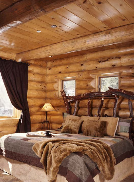
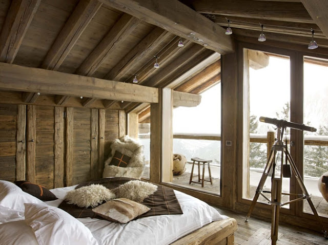
DORMITORIOS RÚSTICOS - RUSTIC DECORATING


domingo, 2 de octubre de 2011
EVOLUTION OF A ROOM–Part Three
If you read this blog, you know the story well. A few years ago, after replacing my kitchen’s tile countertop with white marble, my yellow walls looked horrible. Since all the rooms downstairs open up to each other, I was forced to paint them all a new color - Feathered Gray by Pratt and Lambert – which is a warm gray shade that looks taupe in certain light. But after the walls were repainted, nothing went together anymore. My yellow silk curtains looked terrible against the new paint color, as did all my other fabrics.
For the past two years, I’ve been slowly changing out the curtains and the fabrics so it looks more like a decorator with some sense of color lives here. The last room that finally got its new fabrics was the dining room. Thinking back on all the dining rooms I’ve ever had – starting with my first single girl apartment - I realized that I’ve always had a skirted dining table. This actually surprised me, I hadn’t been aware that I’ve been using the same design element over and over and over again. Was there a lesson in this? I suppose if you really love something, you should go for it, regardless of what the current trend is. If I listened to trends, I would have replaced my skirted table with a Rough Luxe unstained wood table that so many of the young are buying these days.
So, today, I thought I would bore you to death by looking at the evolution of my dining rooms through the years. Actually, I probably should say the non-evolution of my dining room skirted table. Enjoy!!
The Rough Luxe table by Restoration Hardware that everyone under 40 wants to buy.
Twenty two years ago, right after we were married, Ben and I rented this cute, tiny cottage. For the dining room, I brought my skirted table that had been in my pre marriage apartment. I updated it with a new, cream faux silk poly-something fabric with a huge puddle that I spent hours arranging “just right.” I added the set of French chairs that my aunt gave me and a painted secretary from my parents house. We happily lived here for two years - Elisabeth was born while we rented this house. We loved the two bedroom, one bathroom house, but mostly we were thrilled to be living in West University – our dream location. I had gone to look at this house after seeing an ad in the paper and when the landlord answered the door, I said “I’ll take it” without even stepping inside. Not that there was much to tour, you could see everything from the front door. The rent was $600. We were so excited to live in our doll house. My father though, was less so. He took one look at it and said “I worked my whole life to get you out of a house on concrete blocks.” He didn’t see the charm of living in a house without a solid foundation like we did. We left this house to move to Ft. Worth – which was supposed to be for a lifetime. Instead, we only lasted 1 1/2 years away from friends and family before we moved back to Houston.
In Ft. Worth, we bought our first house – a brand new patio style home. While I copied Dan Carithers taupe and white linen living room, I used my old dining room set up. I did add an antique chandelier from my parents house and two woodcuts also borrowed from them. I don’t think we ate one meal in this room, instead we always used the breakfast room where we had a French wood farm table.
And finally, we ended up in our present house in West University. I don’t have a picture of the round skirted table with the draping cream cloth, but I know I used that same set up when we first moved into this house. I do have an early picture of a party tablescape. I had Shabby Slips make up a table skirt out of taupe and white plaid linen to fit over a conference table for when we entertained. I topped that with a white tablecloth. Those French chairs were actually from my breakfast room. Overhead we used the same chandelier. And here, you can see there used to be a window in this room instead of the French door that we installed a few months after we moved in. It looks so strange to see the old window there!
A few years later and I’m still using the conference table for entertaining. The French door is now in place instead of the window and by then, I had bought that antique hutch to hold my newly acquired collection of blue and white transferware. Of course I stole that idea from design great Carol Glasser. I bought those vintage cane chairs from Lewis and Maese. Still no curtains and no rugs. Elisabeth is modeling her outfit of the hour – my bathing suit sarong which she turned into a long skirt. NOTE: After this party, everyone went home with red knees from the cotton table cloths! Be sure to wash those cottons that come from India first.
Sorry all these pictures are no bad! I had no idea I would have a design blog when I took these photographs all those years ago. Here, I had finally started to get somewhat serious about my dining room. I had an oval table custom made to fit the room and seat 8 – so, now I could finally quit dragging out the conference table whenever I entertained. For the skirt I splurged on a Bennison fabric which cost more than a dining room table would have. But, as you can see, I’ve always just preferred a skirted table in the dining room over a wood one. There something so romantic and soft about a beautiful skirted table – and I’ll probably never have a proper wood table. Over the years, the puddling hem was drastically shortened, and the glass top was eliminated. When this picture was taken, I was still using those old German woodcuts which I later replaced with more plates. And, I had put up sconces – that today are in my office.
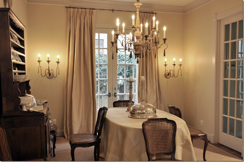
About six or seven years ago, I decided to change the Bennison cloth out for this silk plaid in yellow. At this time, I also painted all the walls a soft golden yellow with gray trim. Along with the paint, we finally got silk ticking curtains in the living room and dining room and custom cut seagrass throughout. The curtains and the seagrass made a huge difference (as did a new camera.) My parent’s antique chandelier went to the breakfast room and I bought this fixture from a friend who was redecorating her house from English country manor to Swedish. New sconces from Tara Shaw were added.
Finally, I changed out my blue and white transferware for some creamware – trying for a quieter look. I honestly thought I would keep this dining room setup forever. I still love the way it looks, but the yellow just didn’t go with the gray walls or the new ivory linen slipcovers in the living room or the white marble in the kitchen. So, new curtain and tableskirt fabrics were ordered to tie it all together. Here’s how the dining room looks today:
The biggest change to the room were the new fabrics – gray taffeta for the curtains and a white matte taffeta for the table. The only expensive fabric was for the table – from Rogers and Goffigon - but the draping and the matte look were important to me and I couldn’t get that look with a cheaper fabric. The silk taffeta at the windows is Schumacher and that fabric was very reasonable.
The chair slips are actually two pieces, one piece covers the back and one covers the seat. There is a down cushion inserted into the bottom slip to make the chairs look and feel softer. Ties run down the back of the slips. The skirts are double pleated for extra frill. The checked linen is Chelsea Editions and is very, very reasonable.
The view of the hutch with the creamware collection. I wonder if I should trade this out for a gray painted Swedish hutch. Maybe in a few years!
A closeup of the back of the slip with the ties.
Here you can see how pretty the seat crowns with the attached down cushion.
We left the wood arms exposed on the host chairs. I like that small touch of wood showing through.
On the table, I added some creamware plates to make it look casually styled. Where is Eddie Ross when you need him????
Two of my favorite things in the room – the sconces from Tara Shaw and the antique barometer I got for a steal on 1st Dibs.
While all the changes made a big difference, the slipcovers made a huge, huge difference. I am really happy with the way they turned out. They make the room look dreamy and feminine and so soft. Right now, I am in love with them!!!
So, that’s it. It took a while to update all the fabrics downstairs. They always say, when you change one thing in your house, it all dominoes and that was true with me. The white marble countertops dictated the way my entire downstairs looked – something I hadn’t really thought about when we made that initial change, but truthfully, I probably was just in denial. Changing out the fabrics room by room made is easier on the pocketbook. Plus, Ben wasn’t really aware of what it all cost in the end since it was such a drawn out process. He loves the way it all looks now, but if I would have come to him and said – I’m redoing every room next month, he would have had a heart attack and had me committed. It was more subtle this way. He likes my decorating style, he just doesn’t like what it costs. AND, he is under the misguided impression for some unknown reason that slipcovers are cheap! SSSSHHH – let’s keep it a secret, ok? Thanks!
I’m wondering if I’m alone out here, using the same design element over and over and over again – like the skirted table? That’s really the only thing I can think that I’ve used since I had my first apartment up until my current house – over 30 years of using skirted dining room tables. Do you have an element or style you use over and over again? Something you have loved since you left college, married and had children? Let me know what it is – I would love to hear what you are addicted to!!!


FINALLY:

If you are a Rachel Ashwell fan, you will love her new book. It’s really beautiful – filled with flowers everywhere and gorgeous shabby chic styling. It features the home of many European friends this time – a switch for the Californian Rachel. It also shows her new Texas property, The Prairie. It’s totally heavenly. So, if you are a Shabby Chic lover, I highly recommend it HERE.
DORMITORIOS CON PAREDES COLOR GRIS

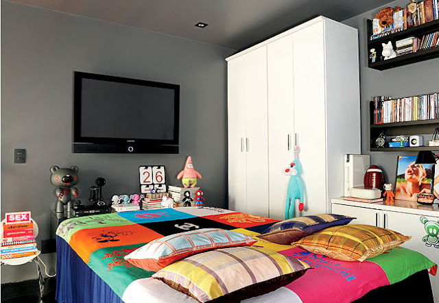
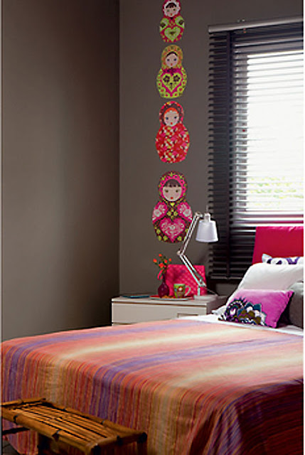
Dormitorio gris 3: Amante de toy art - arquitecta Andrea Murao - adhesivos de muñeca matrioska - cabecera color rosa.
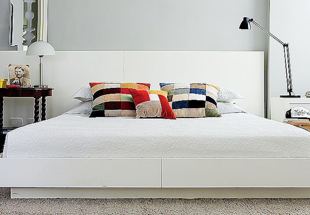
Dormitorios gris 4: Arquitecto Marcos Marcelino - cabecera laqueada en color blanco.
¿Te atreves a pintar las paredes de color gris oscuro? El gris de las paredes transmite reposo y tranquilidad, y hace que los cuadros y fotos de las paredes destaquen más. Dale la vuelta a una habitación simplemente jugando con el color... recuerda que el ambiente debe tener bastante luz natural, muebles claros y accesorios coloridos para que se vea mucho mejor... si el ambiente a decorar no cuenta con mucha luz puedes usar gris claro.
sábado, 1 de octubre de 2011
INTERESANTE DISTRIBUCION DEL DORMITORIO PEQUEÑO
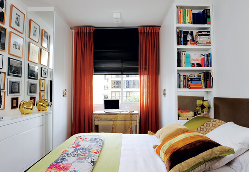
ESTILOS DE DECORACION TENDENCIAS Y TIPOS DE DECORACION DE DORMITORIOS

Aqui se explica las tendencias o estilos de decoración que existen no solo para la decoración de dormitorios sino tambien para la decoración del hogar. En esta entrada en especial se explica brevemente cada uno, pero luego dedicaremos una entrada a cada tipo de decoración.
Minimalismo

En definitiva un estilo que invita a vivir en ambientes apacibles, sosegados y en el que los muebles sencillos adquieren todo el protagonismo.
Rústico
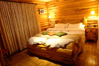
Predominan en este estilo las maderas más nobles, pero con un tratamiento prácticamente nulo. El uso de la madera se aplica a todos los elementos del hogar, desde los muebles más esenciales a paredes y suelos. Para los complementos suele optarse en todo momento por telas bastas como las de saco o linos siempre optando por colores en tonalidades neutras y colores beige.
Los muebles suelen tener acabados macizos y ser muy robustos dejando de lado la sofisticación y las líneas rectas.
Clásico

Apuesta por ambiente en los que predominan los colores cálidos y acogedores. Suelen estar recargados con elementos muy elaborados que se basan en colores fuertes como el rojo, el verde botella o los marrones. En cuanto a estampados predominan los acabados en rayas, motivos florales y frutales.
Los muebles están compuestos por maderas nobles entre las que destaca el nogal y el roble.
Loft

Kitsch o pop-art
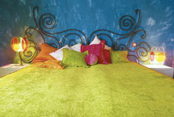
Sin duda uno de los estilos más llamativos y atrevidos del momento que combina colores estridentes como el verde manzana, el rosa chicle o el azul eléctrico con elementos antiestéticos y chillones. Las texturas que utiliza para enfatizar el estilo y realizar mezclas son el papel, el cristal, el plástico, la pieles y sobretodo los elementos sintéticos.
Entre los muebles que lo componen predominan objetos tan estrafalarios como las lámparas de lava, muebles con formas geométricas y sofás recubiertos por almohadones de pelo y cortinas de caireles.
Oriental o exótico

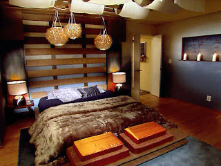
Todo lo que envuelve a este estilo está envuelto por un aroma de serenidad, calma, equilibrio y belleza. Todos los elementos que lo componen como colores, objetos, murales y adornos remiten en todo momento a este tipo de sabiduría. Generalmente tienden hacia la combinación de texturas como son las piedras, la madera o el papel en contraste con el agua con fuentes, las velas y los inciensos. Todo ello sin dejar de lado nunca la presencia de la naturaleza que se establece a través de las piedras, el agua y las flores.
Dentro de esta tendencia también destaca la decoración enfatizada a otras culturas como la africana. La utilización de motivos del África, es parte de una tendencia mundial en la decoración que representa una revaloración del estilo étnico. Accesorios para la sala, figuras decorativas de animales salvajes o muebles forrados en pieles, sorprenden a algunos y cautivan a otros.
Suelen destacar los colores de la tierra, los rojos, ocres y amarillos, tejidos naturales como el lino o el algodón… en definitiva todo lo que evoque a la tierra y a la madre naturaleza.
Zen
Chic o Shabby Chic

El chic se destaca por la utilización de muebles antiguos, pero a la vez actualizados, se trata de darles un toque envejecido, pero nunca gastado ni viejo. Se apoya principalmente en accesorios y muebles. Lámparas y arañas antiguas patinadas, con caireles y un toque romántico.
Muebles antiguos pintados o patinados, combinados con telas actuales y muebles modernos. Tapizados, almohadones y cortinas con flores.
Contemporáneo
El estilo Contemporáneo:
Moderno
El estilo moderno:
Californiano
El estilo californiano:
Colonial
El estilo Colonial:
Lounge
El estilo Lounge: